JESS HIGGS
  • Home
  • First year
    • Introducing Visual Communication >
      • The Comic
      • Technical Skills >
        • Week 1
        • Week 2
        • Week 3
      • Drawing & Visualisation >
        • Week 1 & 2
        • Week 3
      • Colour & Composition >
        • Week 1
        • Week 2
        • Week 3
      • IT Fridays
      • Workshops
      • Other Bits
    • Multi-Dimensional >
      • 2D
      • 3D
      • 4D
      • Workshops
      • Set Exercise
  • Second Year
    • Designer's Toolkit >
      • Alignment & Hierarchy
      • Contrast & Negative Space
      • Balance & Colour
      • Hotfoot
    • Type & Typography >
      • Hierarchy & Layout
      • Magazine Layout
      • Responsive Digital Type
    • Graphic Designs Projects >
      • D&AD - Monotype
      • Museum Brand Identity
      • Information is Beautiful
      • WWB Anniversary Brief
    • The Critical Designer >
      • Research Blog
  • Third Year
    • Advanced Design Projects >
      • Design for Exploration
      • Design for Awareness
      • Design for Persuasion
    • Graphic Design Showcase >
      • D&AD
      • Branding
      • Packaging
      • Editorial
      • Animation
      • 24 Hour Brief
    • Degree Show >
      • Show Prep
Editorial Brief: The Alphabet for Adults 
​

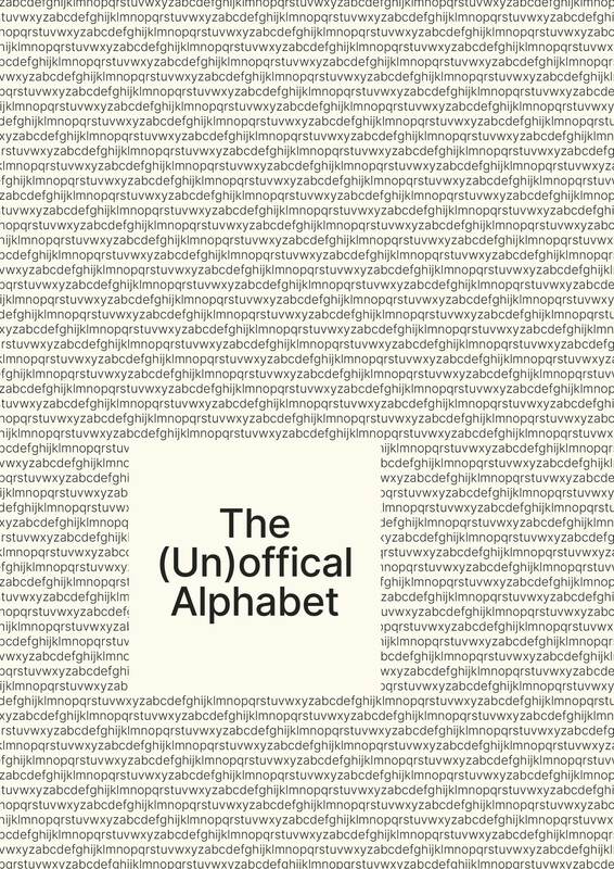
The Unofficial ABCs
​

Project Overview 
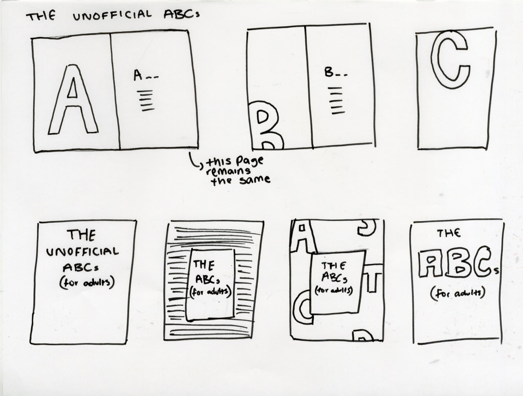
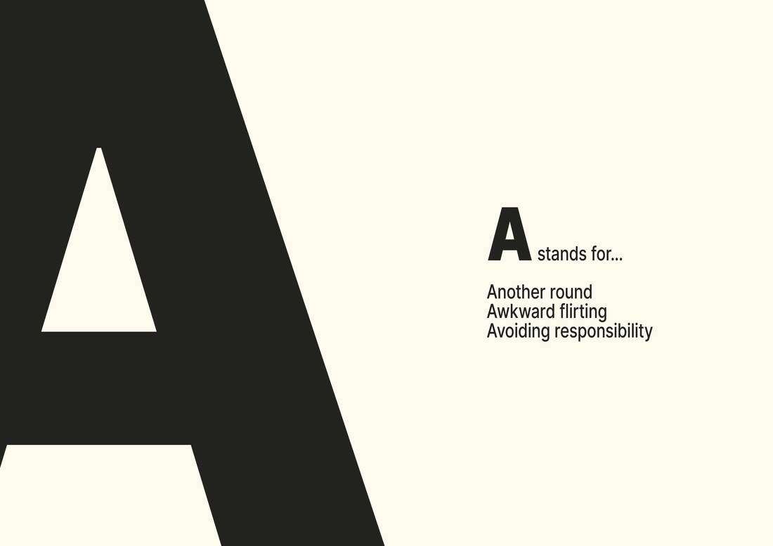
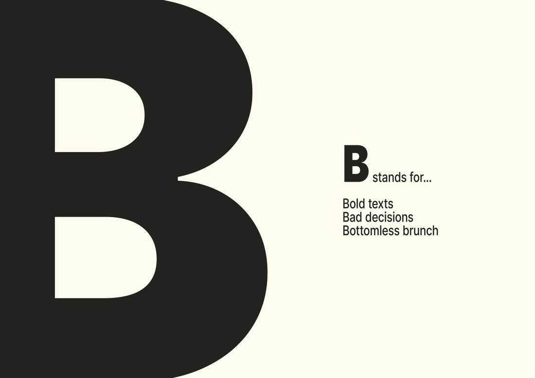
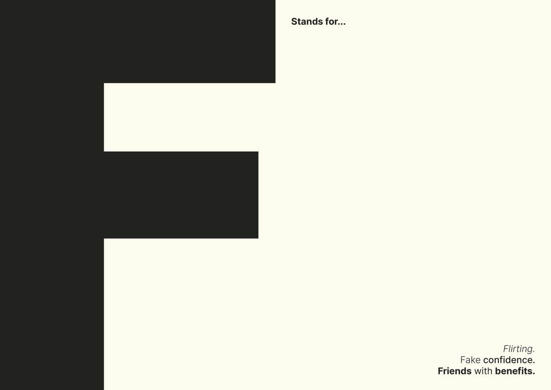
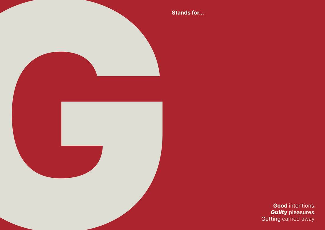
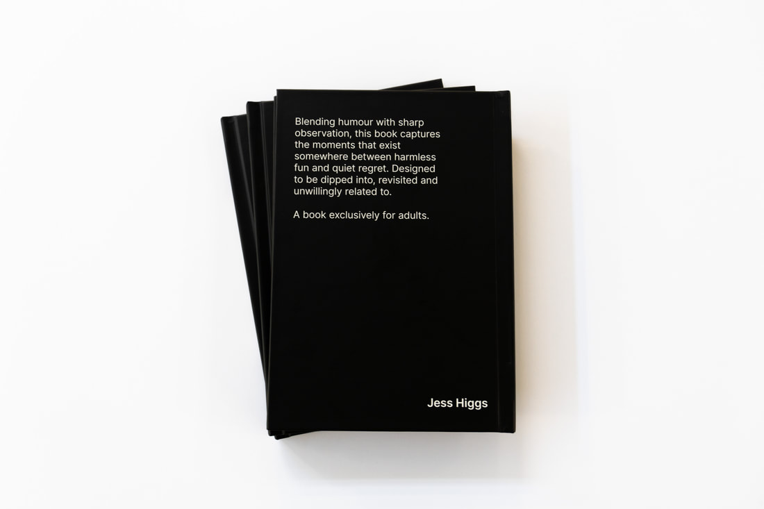
This project involves designing a bold, visually driven book where each page explores a single letter through large-scale typography and curated phrases. It is designed to combine adult humour and expressive design. 
 
Direction 
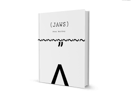
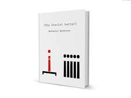
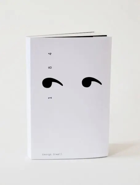
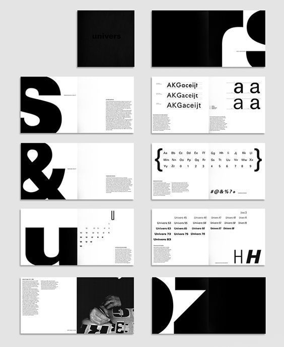
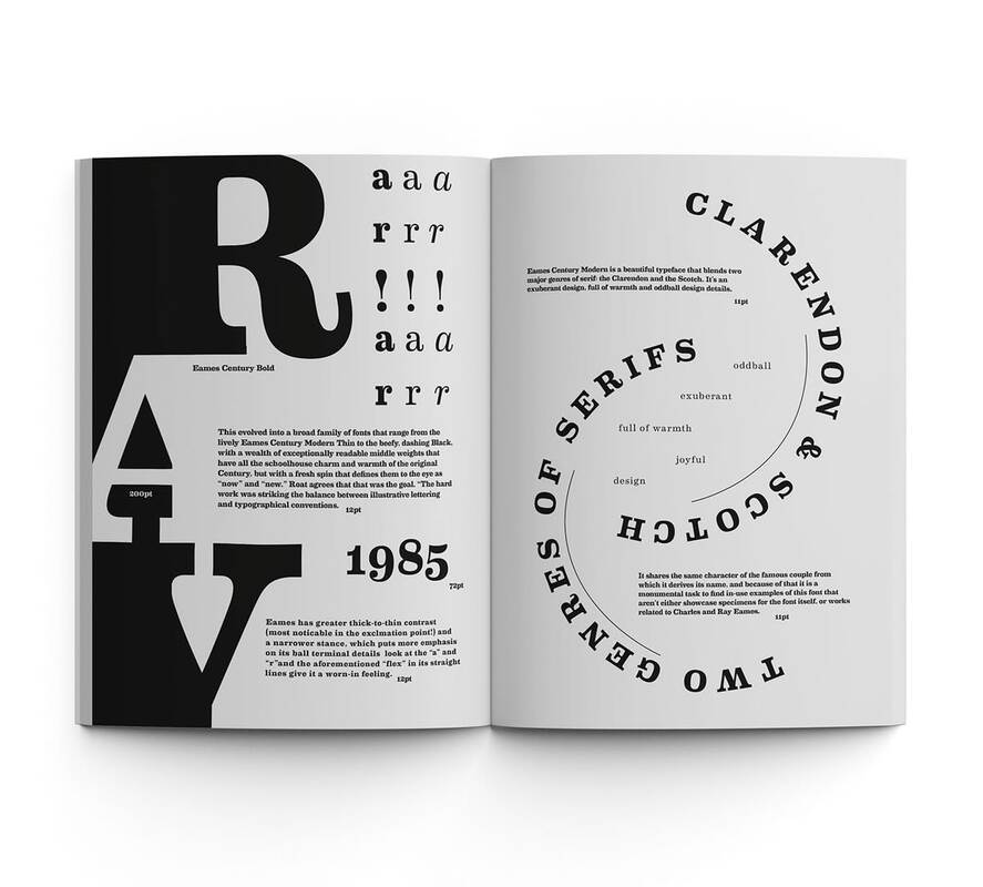
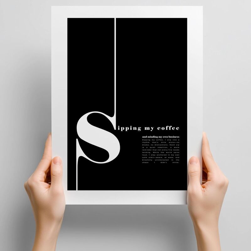
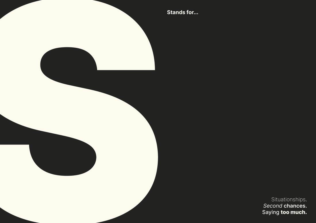
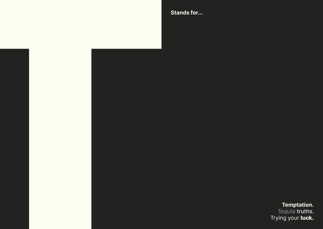
Emphasise oversized, expressive typography by experimenting with typefaces, weights and layouts of each letterform. No imagery is to be used apart from that created out of the letterforms themselves.
 
Deliverables 
Full book design and a series of spreads showcasing a range of letters 
Mockups of final book and spreads
 
Target Audience 
Creatives or simply just adults who want a well-designed yet funny book to sit on their table or shelf.
​

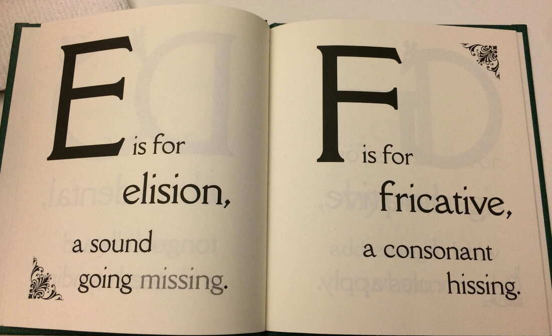
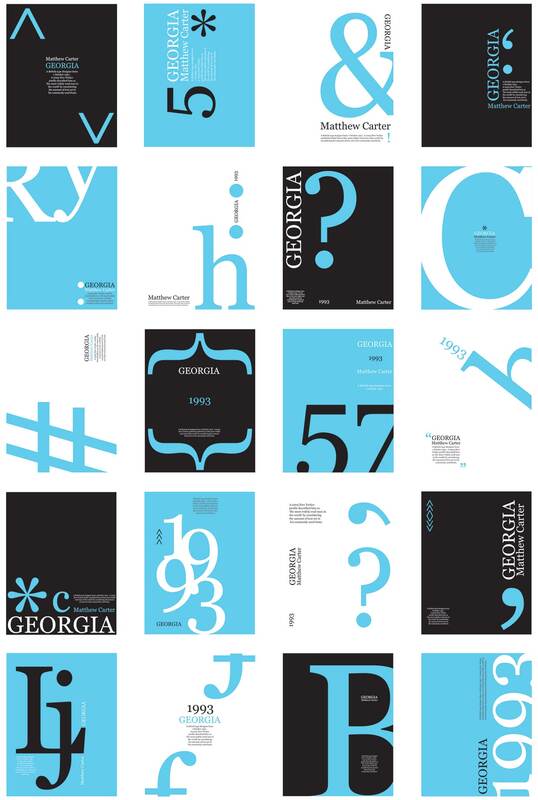
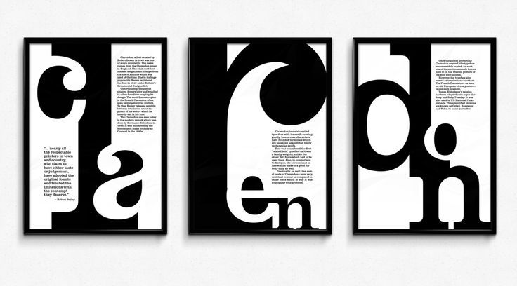
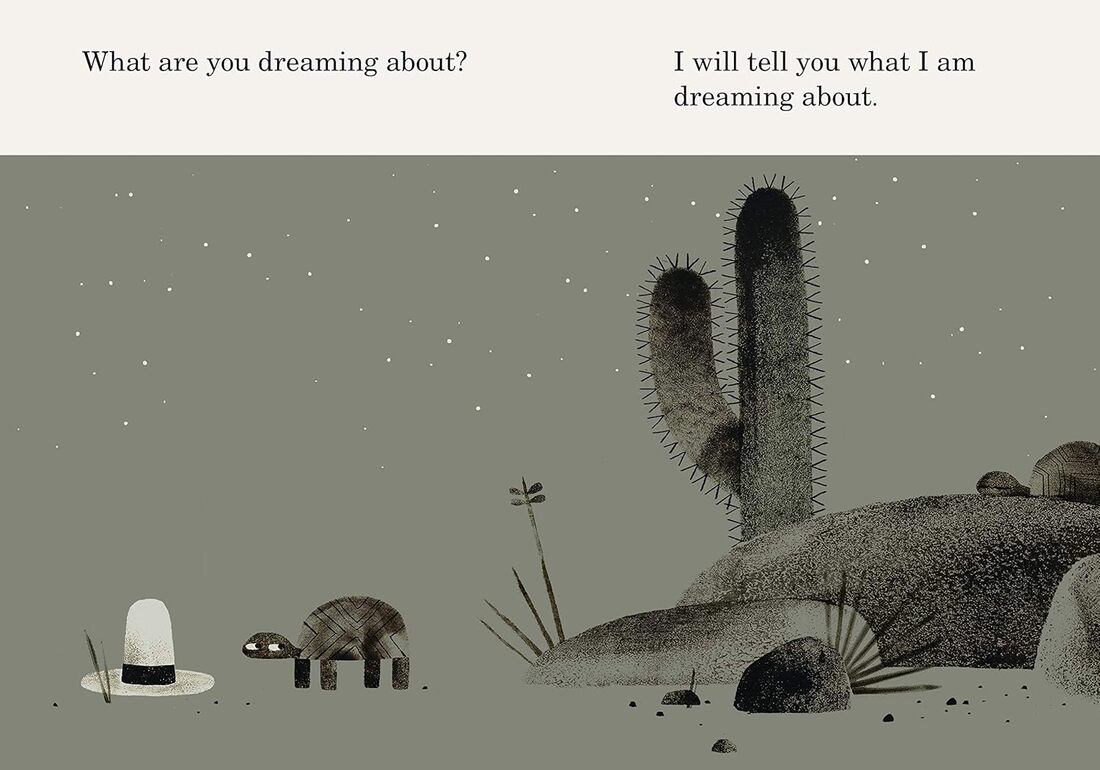
Research

Picture
Picture
Picture
Picture
Picture
Picture
Picture
Picture
Picture
Picture
Picture
Picture
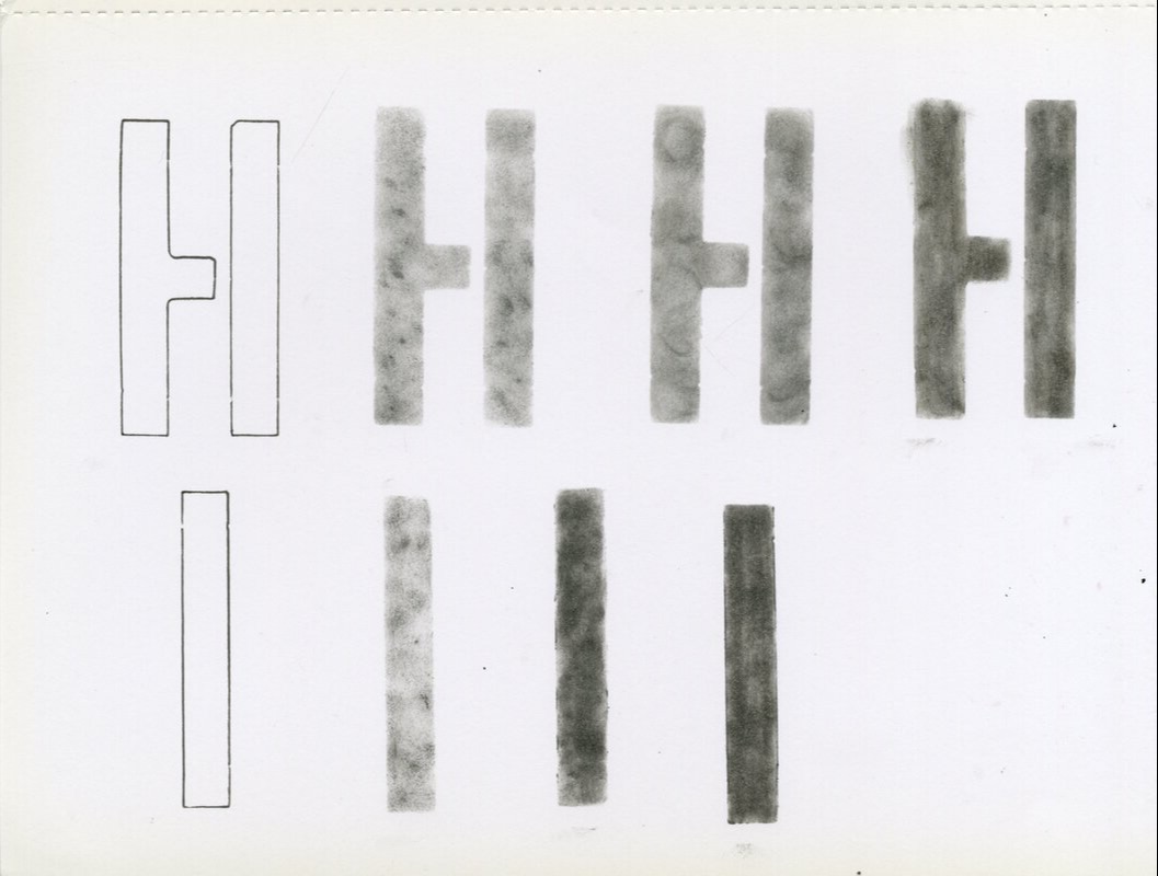
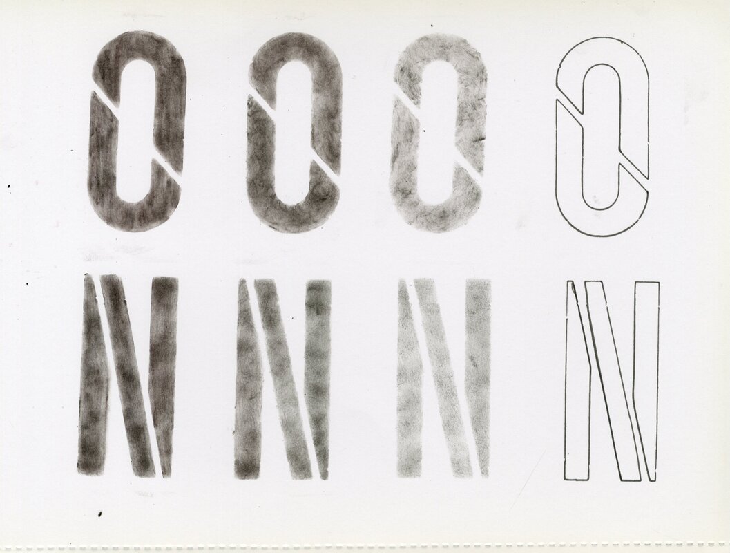
Letter Scans
Picture
Picture
Picture
Picture
Picture
Picture
Picture
Picture
Picture
Picture
Picture
Picture
Picture
Picture
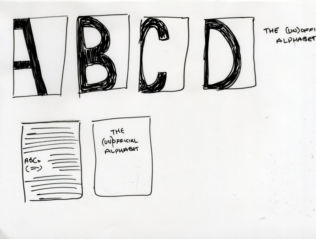
Original idea was to make the letters in different analogue methods but decided to go with a more clean, consistent approach instead.
Picture
Picture
First Draft
Picture
Picture
Picture
Layout was boring and not engaging at all.
Second Draft
Picture
Picture
Picture
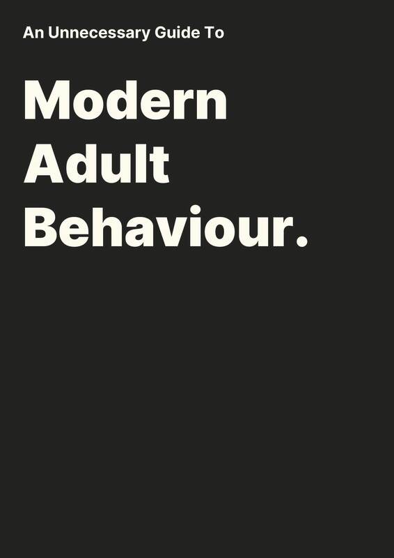
Layout was getting there but it still looked bland.
Third Draft
Picture
Picture
Picture
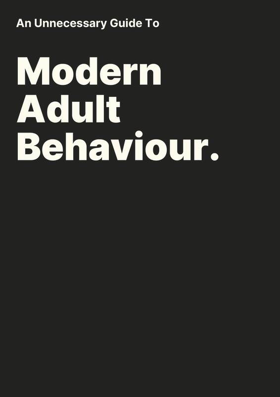
Added a colour to split the layout up.
Picture
Picture
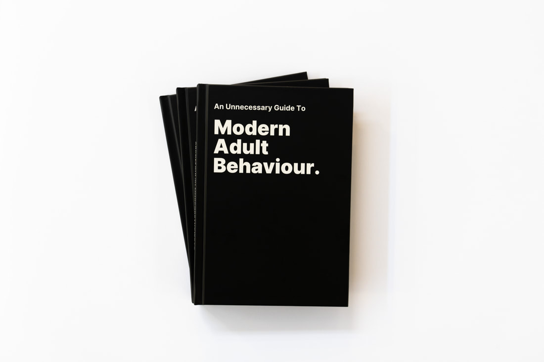
Got my book professionally printed.
Site powered by Weebly. Managed by 34SP.com
  • Home
  • First year
    • Introducing Visual Communication >
      • The Comic
      • Technical Skills >
        • Week 1
        • Week 2
        • Week 3
      • Drawing & Visualisation >
        • Week 1 & 2
        • Week 3
      • Colour & Composition >
        • Week 1
        • Week 2
        • Week 3
      • IT Fridays
      • Workshops
      • Other Bits
    • Multi-Dimensional >
      • 2D
      • 3D
      • 4D
      • Workshops
      • Set Exercise
  • Second Year
    • Designer's Toolkit >
      • Alignment & Hierarchy
      • Contrast & Negative Space
      • Balance & Colour
      • Hotfoot
    • Type & Typography >
      • Hierarchy & Layout
      • Magazine Layout
      • Responsive Digital Type
    • Graphic Designs Projects >
      • D&AD - Monotype
      • Museum Brand Identity
      • Information is Beautiful
      • WWB Anniversary Brief
    • The Critical Designer >
      • Research Blog
  • Third Year
    • Advanced Design Projects >
      • Design for Exploration
      • Design for Awareness
      • Design for Persuasion
    • Graphic Design Showcase >
      • D&AD
      • Branding
      • Packaging
      • Editorial
      • Animation
      • 24 Hour Brief
    • Degree Show >
      • Show Prep