Packaging Brief: Reverse Gender Razor Packaging
Project Overview
This project explores how gender stereotypes are communicated through packaging design by restructuring two existing products with reversed gender aesthetics. The goal is to challenge conventional visual language by swapping the typical masculine and feminine design cues.
Selected Products
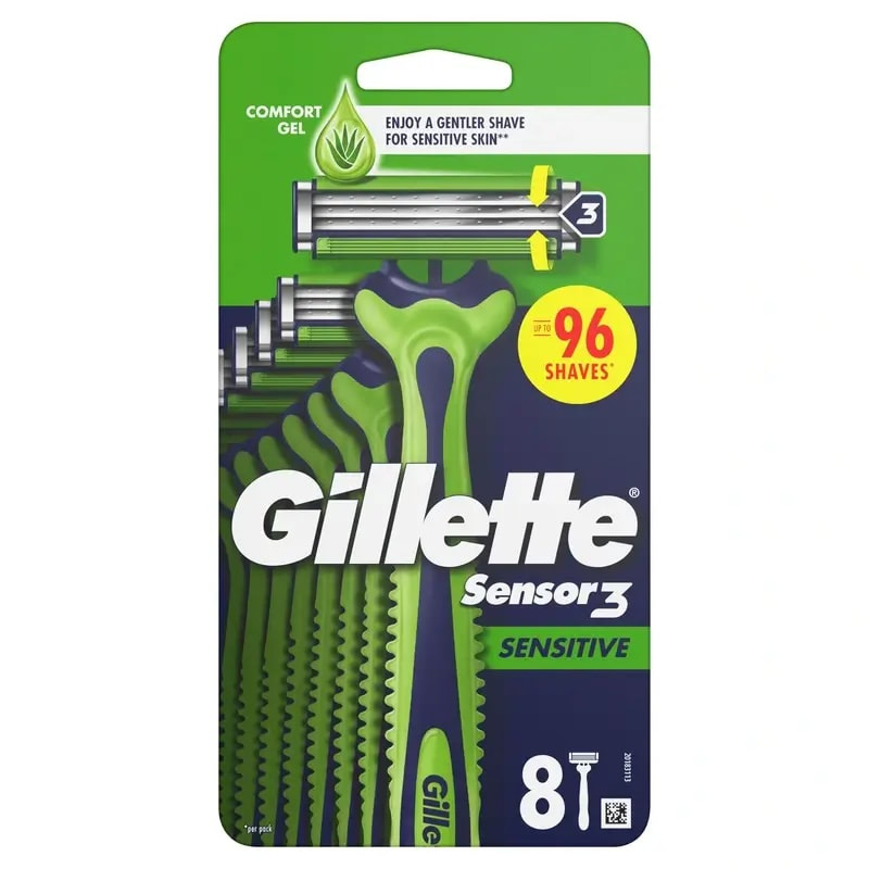
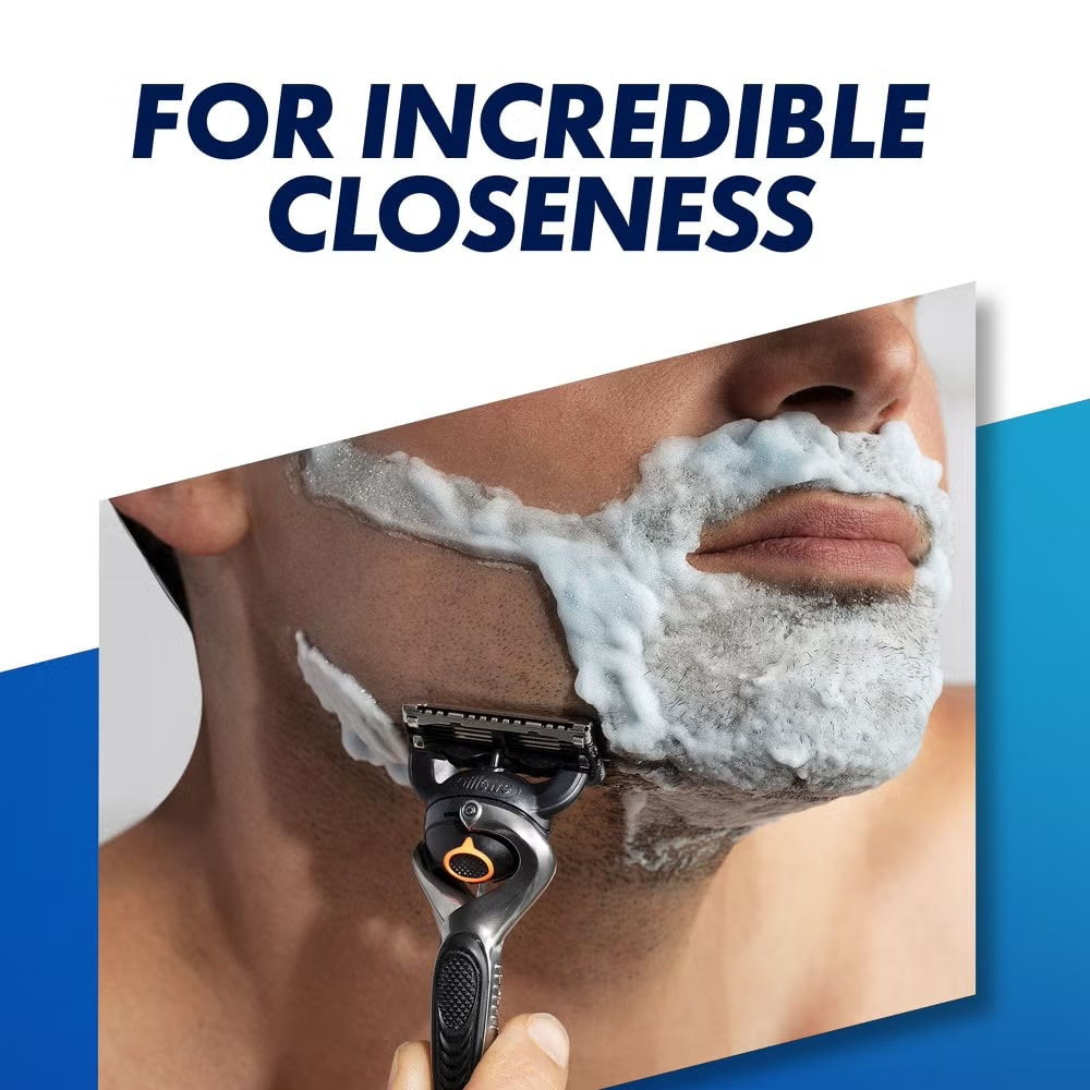
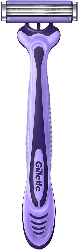
Men’s razor – Gillette Sensor3
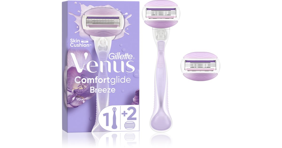
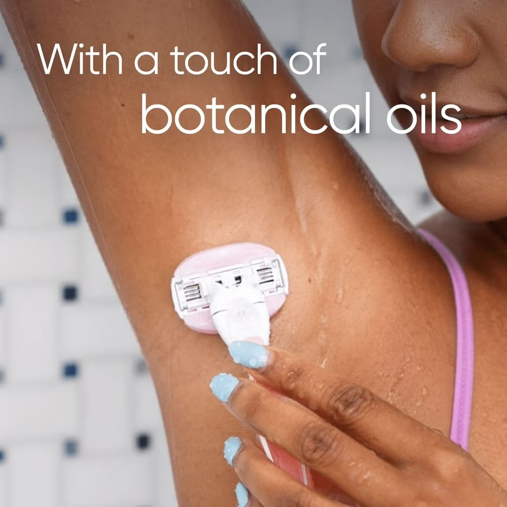
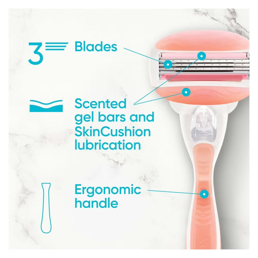
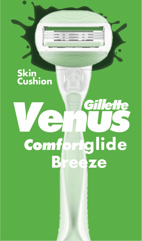
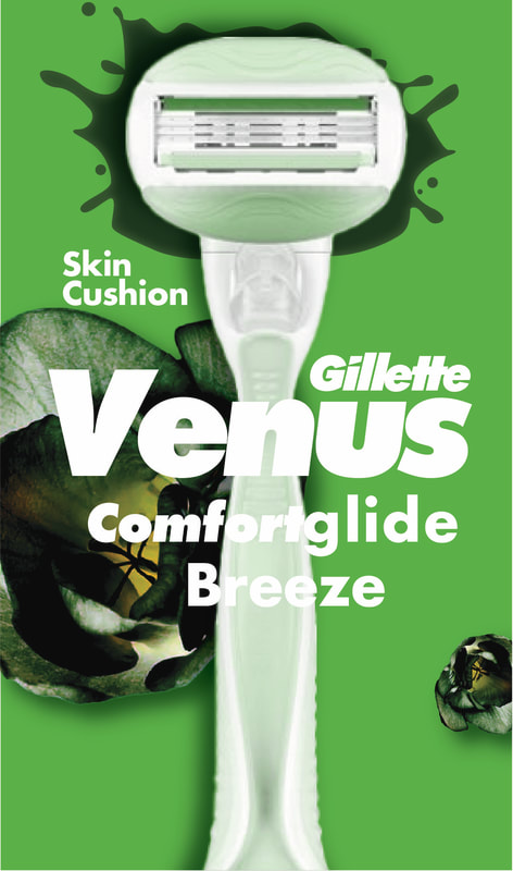
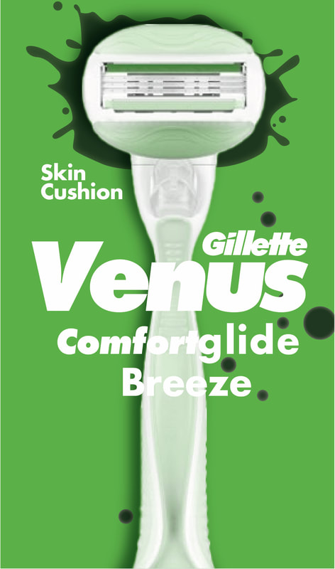
Women’s razor – Venus Gillette Comfortglide Breeze
Direction
Apply feminine coded aesthetics to the male product and masculine coded aesthetics to the female product while maintaining brand recognisability.
Deliverables
Two redesigned razor packaging concepts with mockups
Reversed advertisements
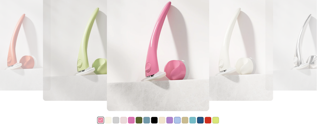
A final packaging introducing a gender-neutral razor concept from the two products
Target Audience
Consumers interested in conversations around gender representation in everyday products and those who simply want a functioning razor.
Project Overview
This project explores how gender stereotypes are communicated through packaging design by restructuring two existing products with reversed gender aesthetics. The goal is to challenge conventional visual language by swapping the typical masculine and feminine design cues.
Selected Products
Men’s razor – Gillette Sensor3
Women’s razor – Venus Gillette Comfortglide Breeze
Direction
Apply feminine coded aesthetics to the male product and masculine coded aesthetics to the female product while maintaining brand recognisability.
Deliverables
Two redesigned razor packaging concepts with mockups
Reversed advertisements
A final packaging introducing a gender-neutral razor concept from the two products
Target Audience
Consumers interested in conversations around gender representation in everyday products and those who simply want a functioning razor.
Research
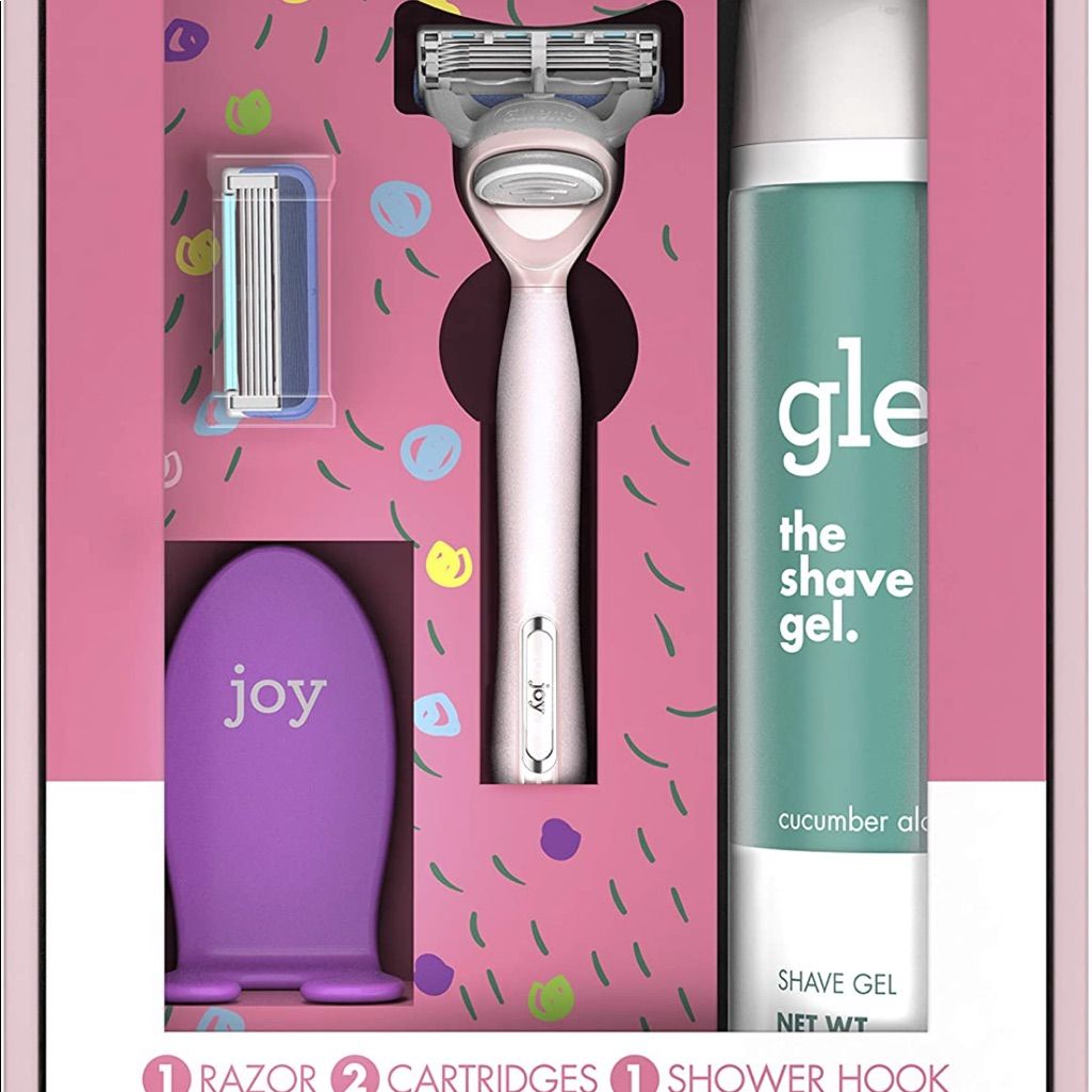
'Female' Packaging
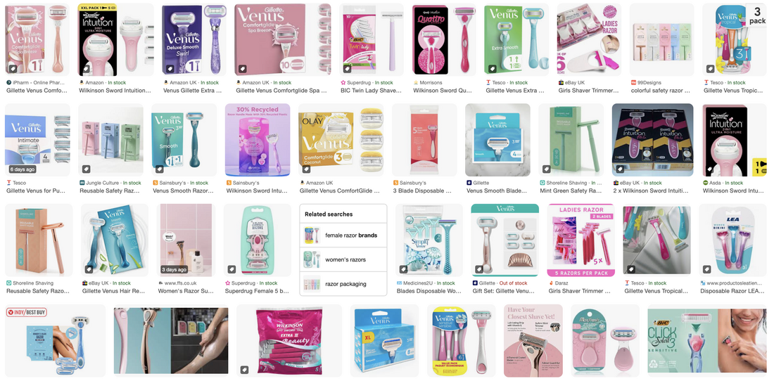
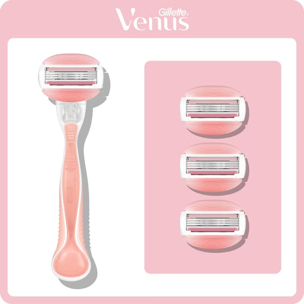
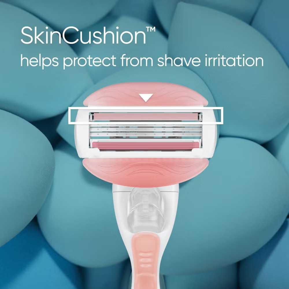
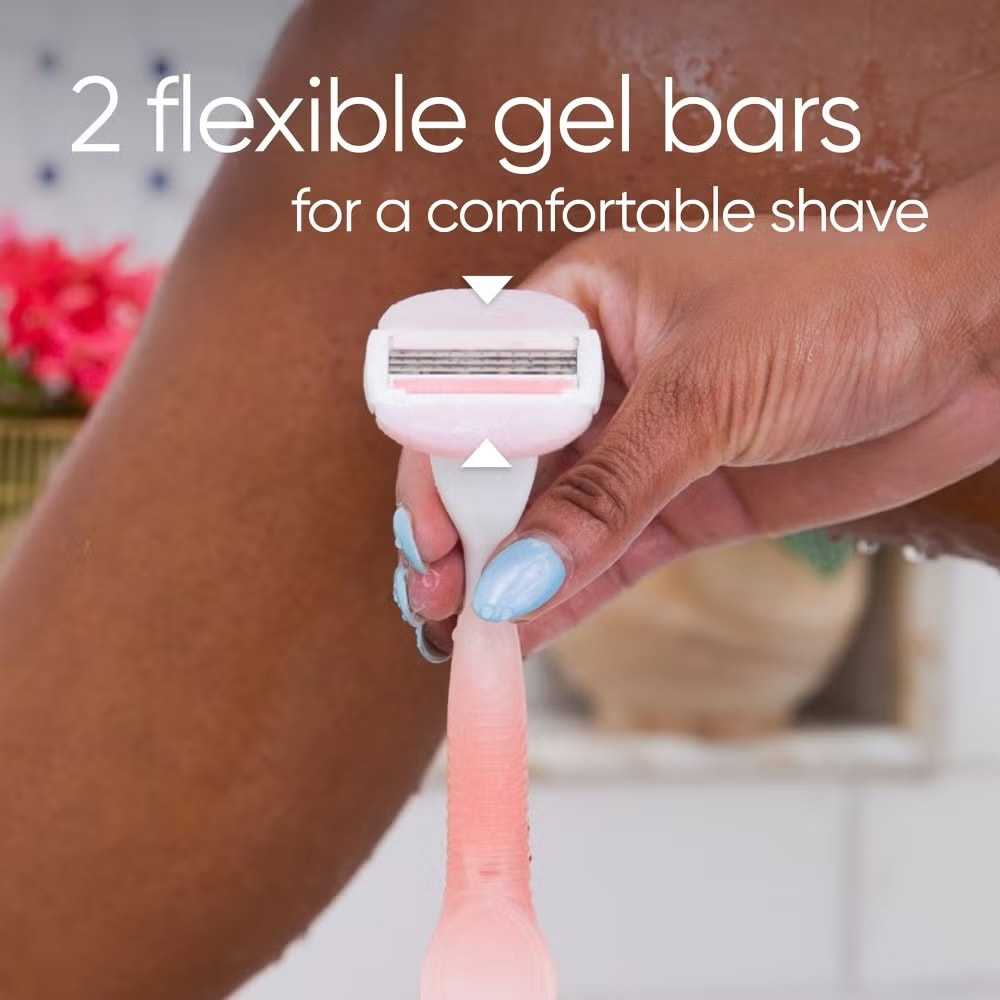
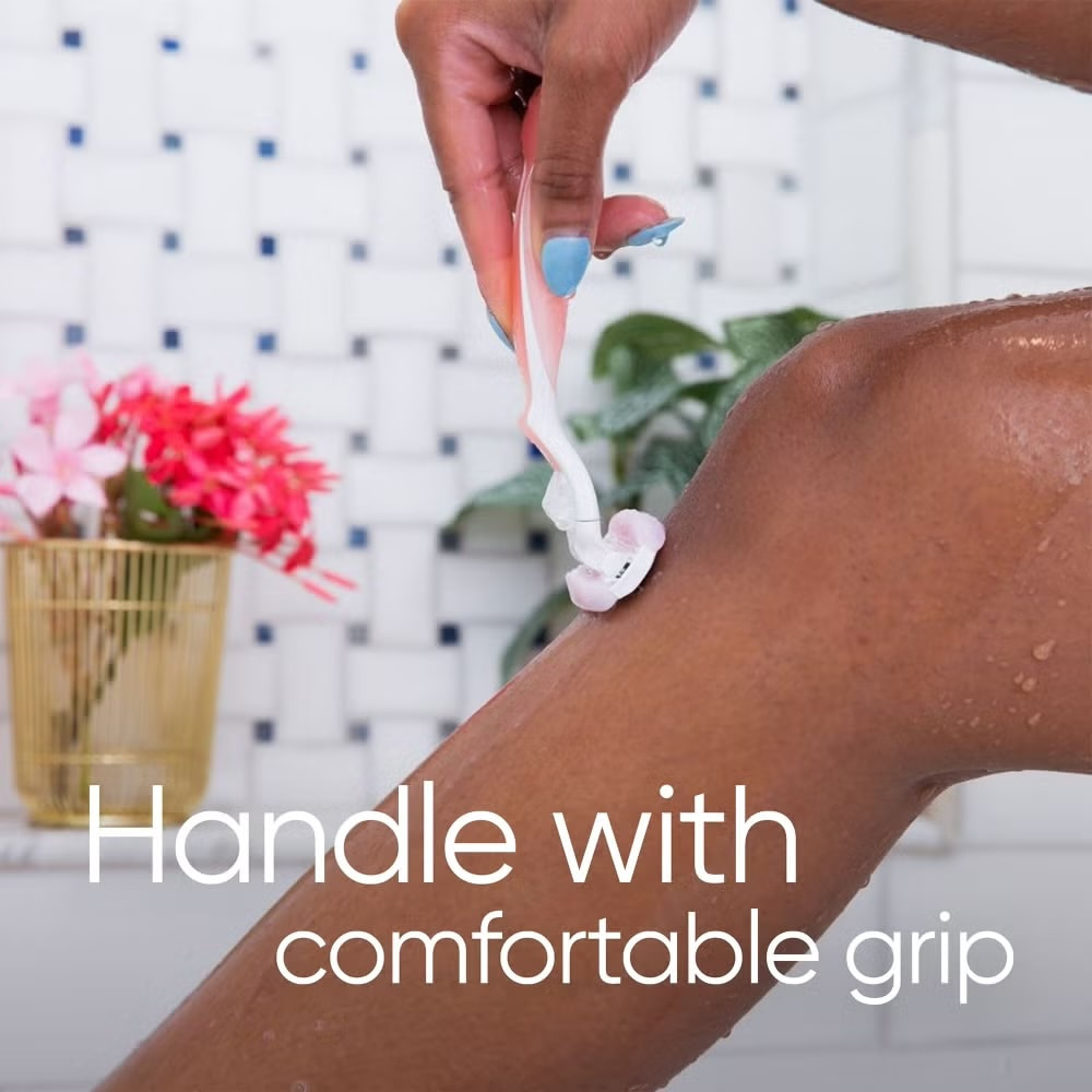
Venus ComfortGlide Spa Breeze
|
|
|
|
|
|
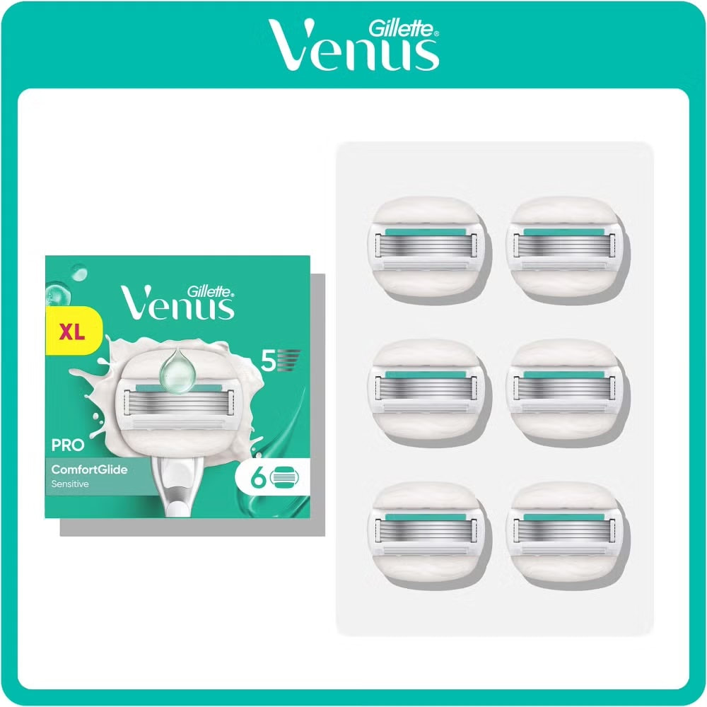
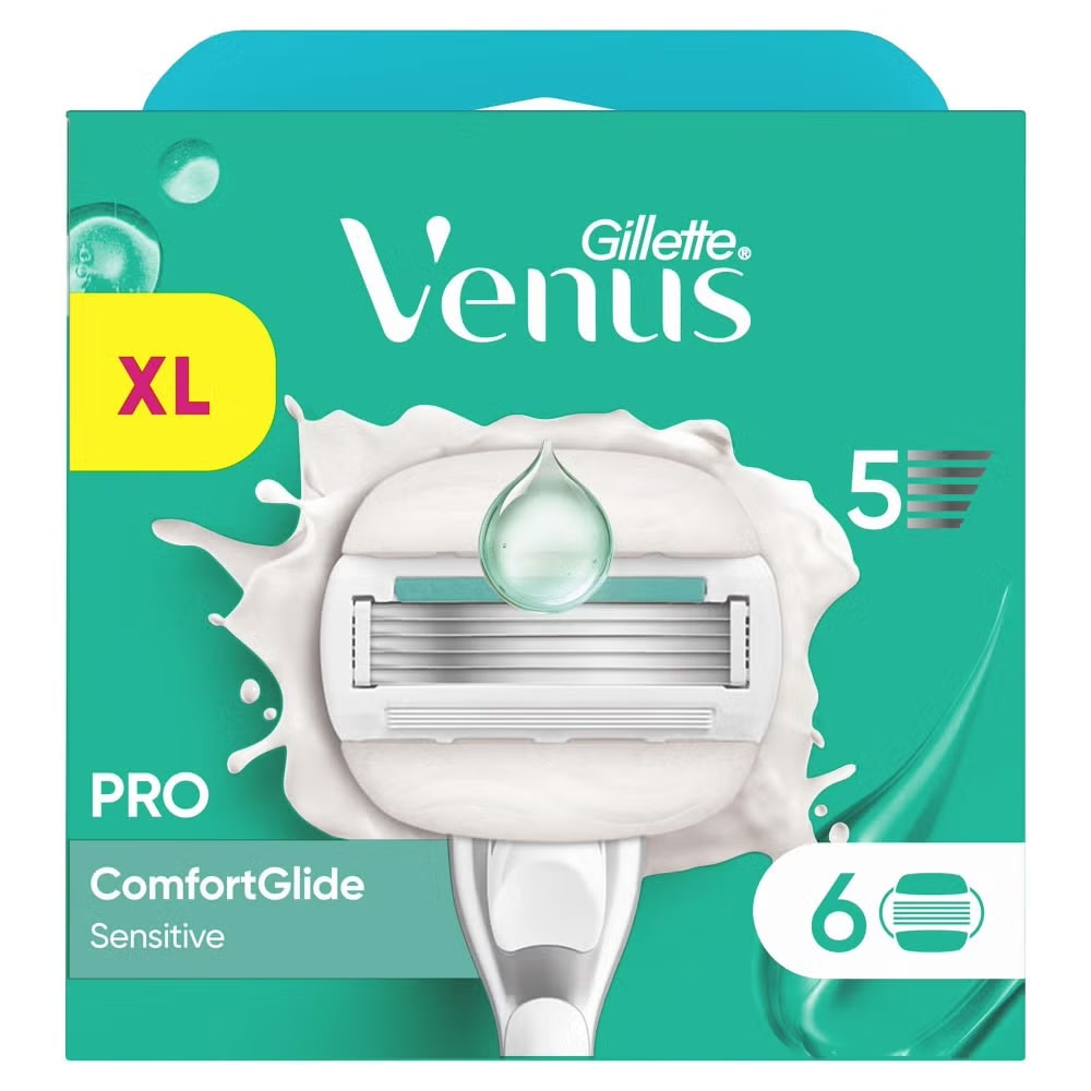
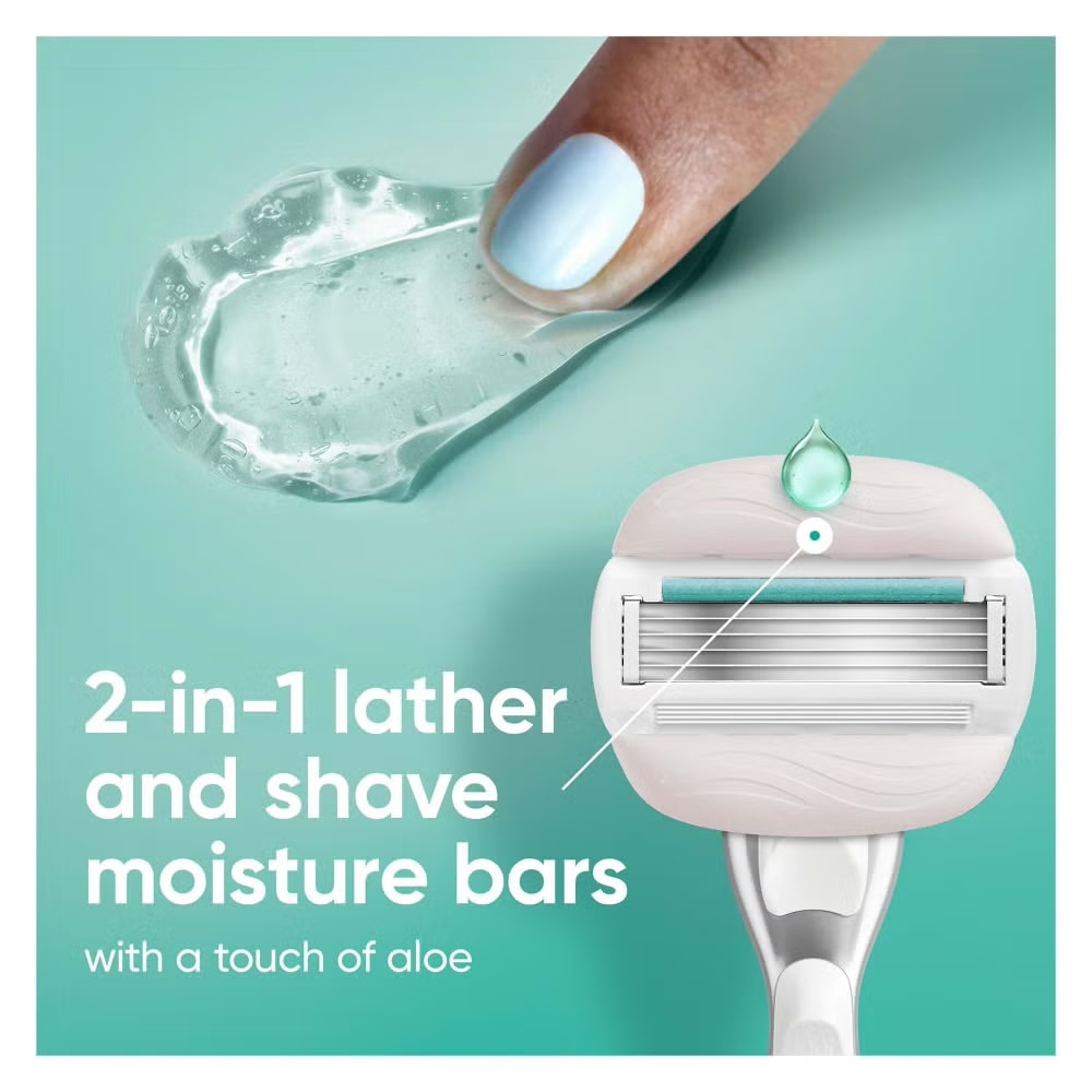
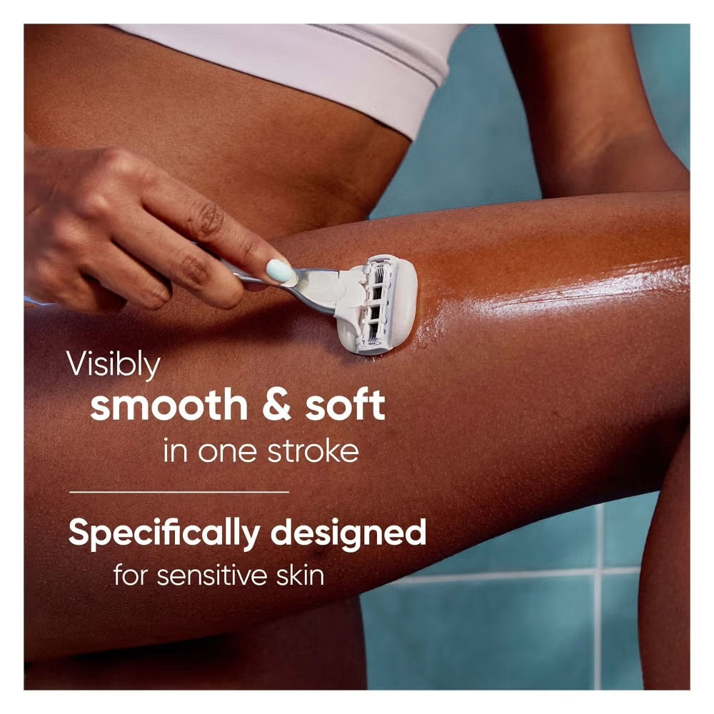
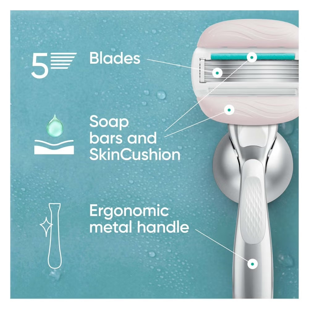
Venus Pro ComfortGlide Sensitive
|
|
|
|
|
|
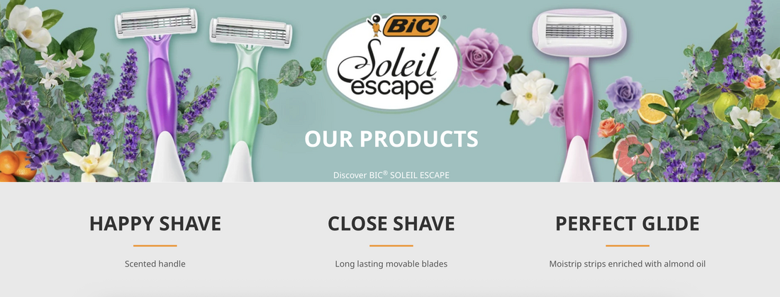
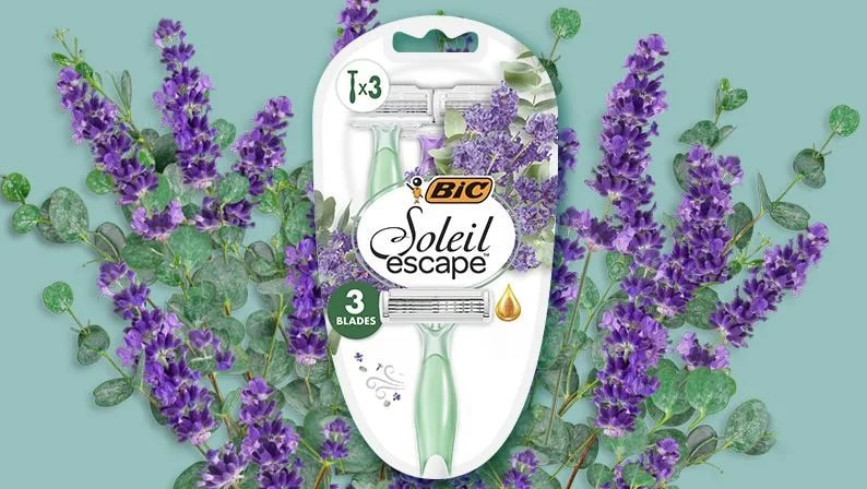
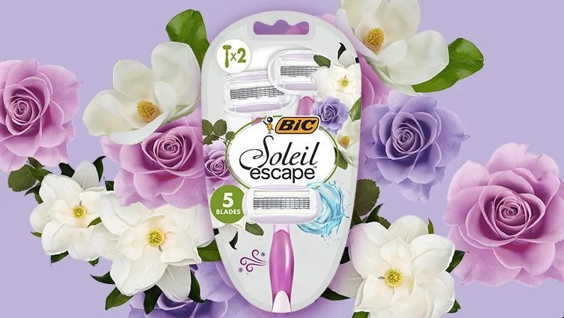
BIC Soleil Escape

|

|
|
|
|
|
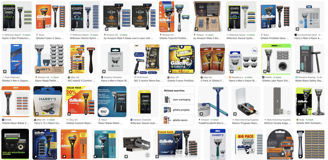
'Male' Packaging
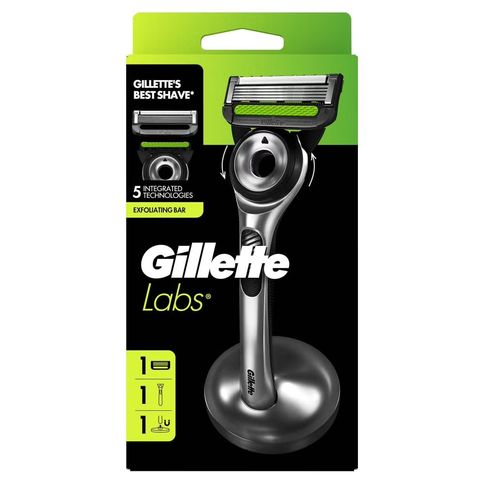
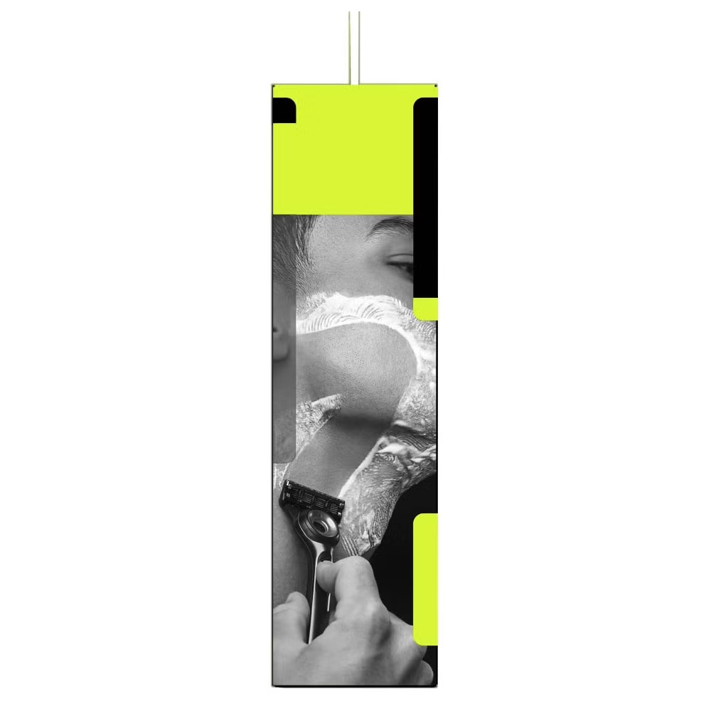
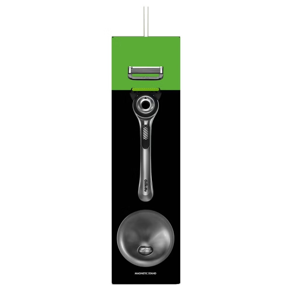
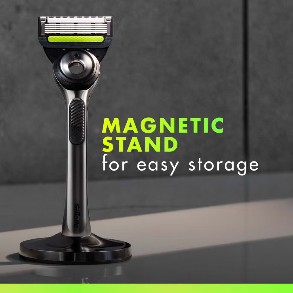
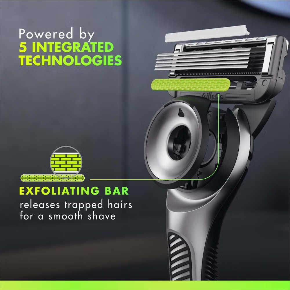
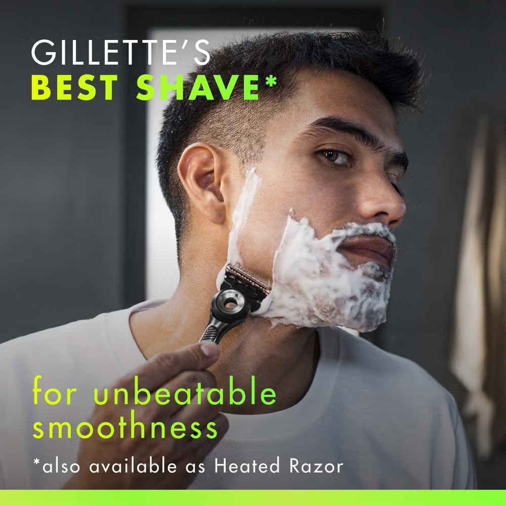
Gillette Labs Exfoliating
|
|
|
|
|
|
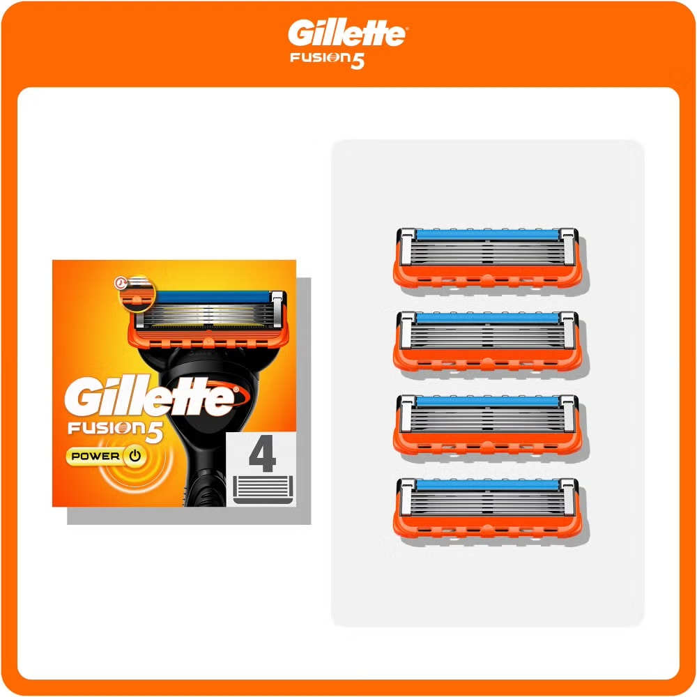
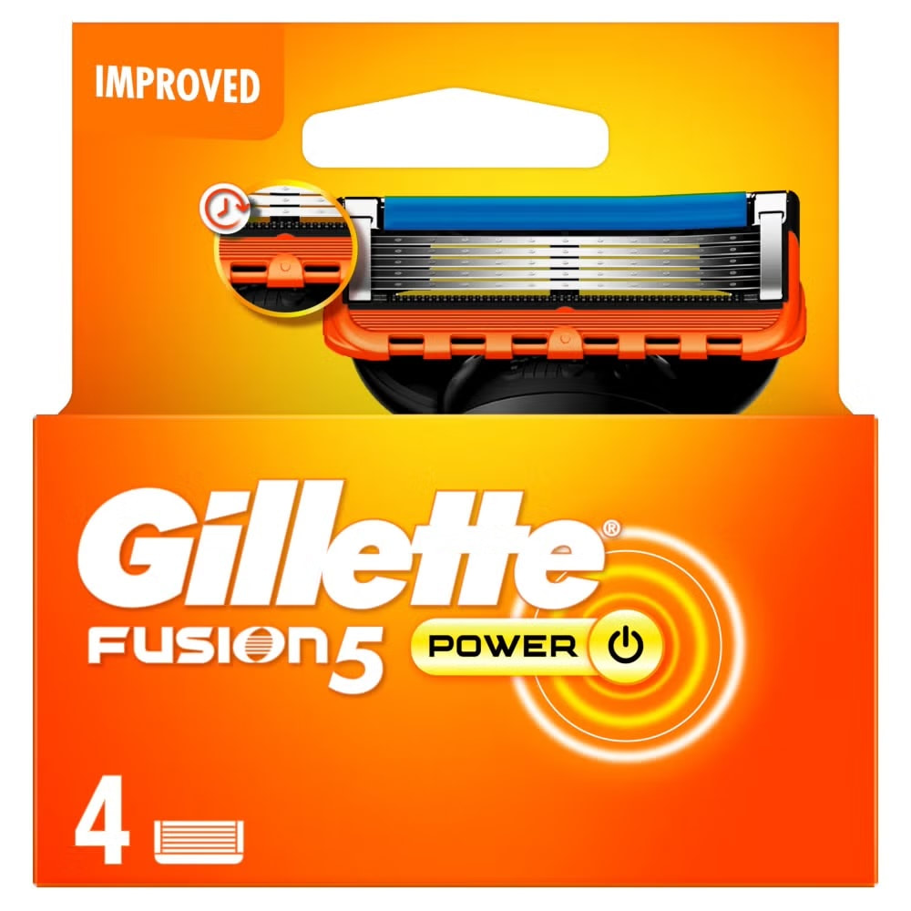
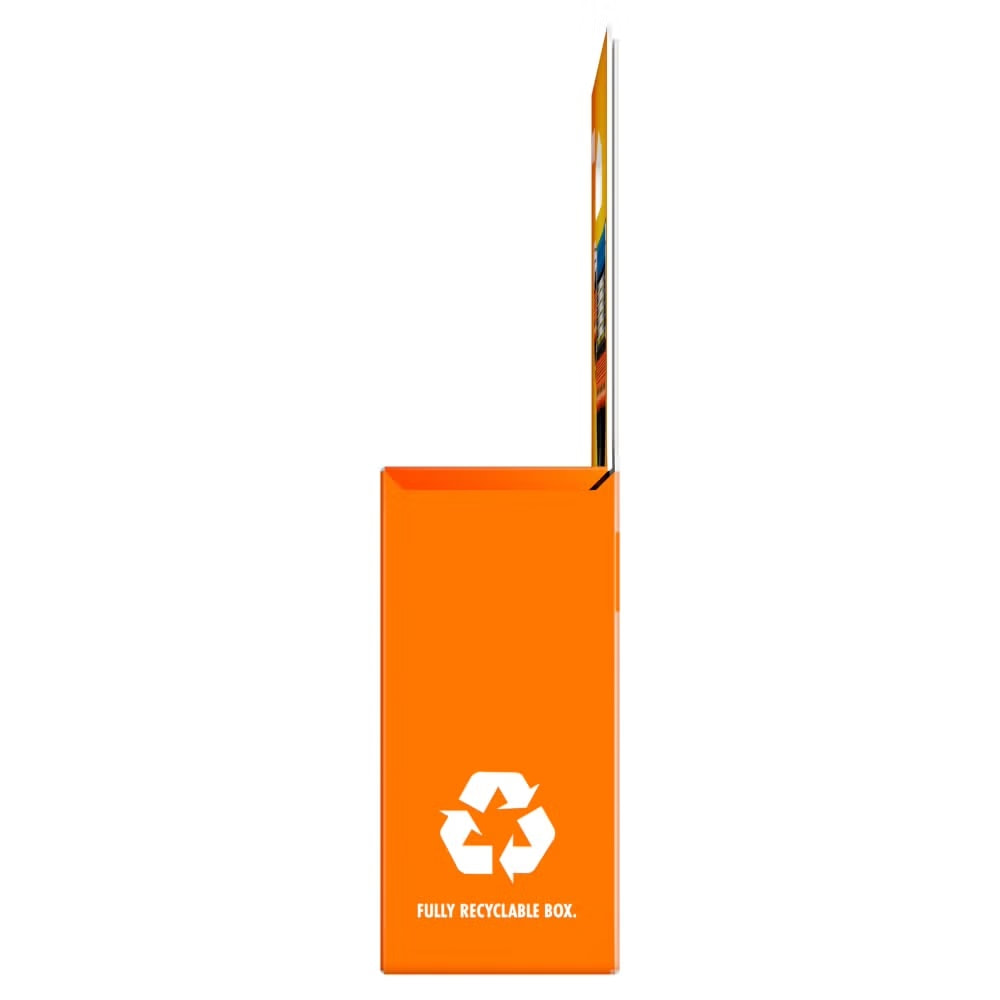
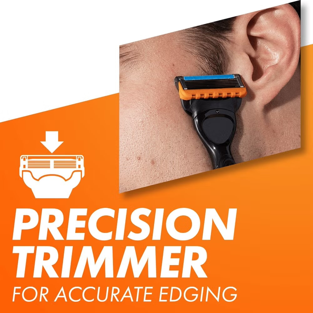
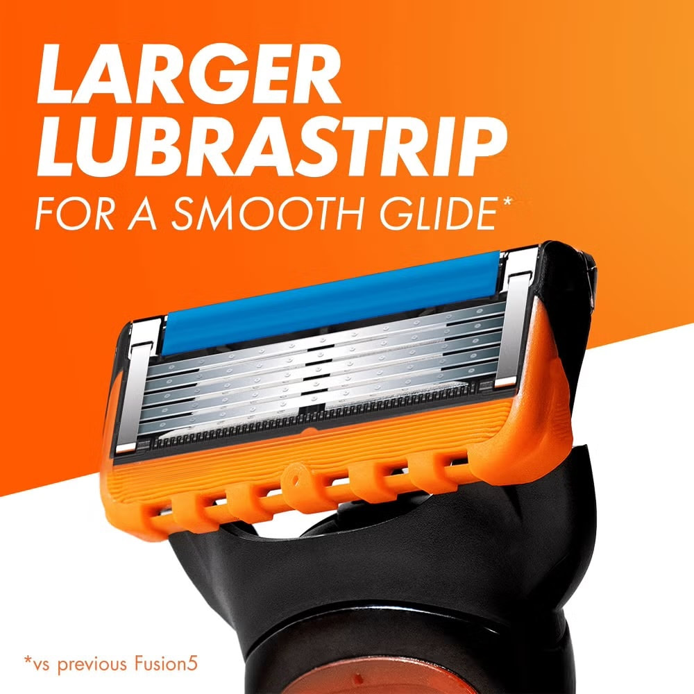
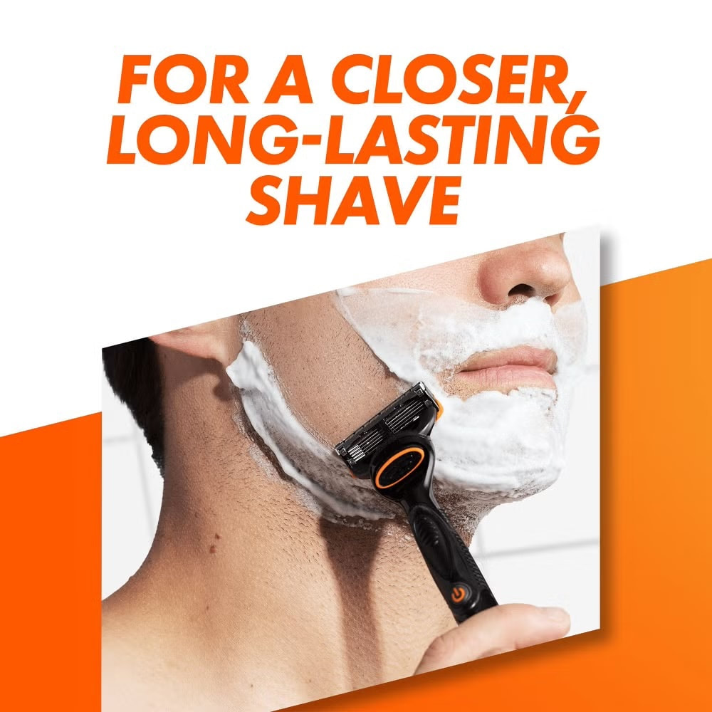
Gillette Fushion5 Power
|
|
|
|
|
|
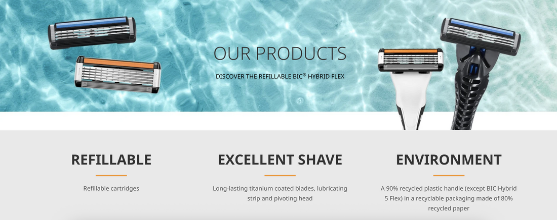
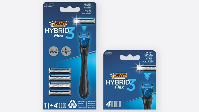
BIC Hybrid Flex

|
|
|
|
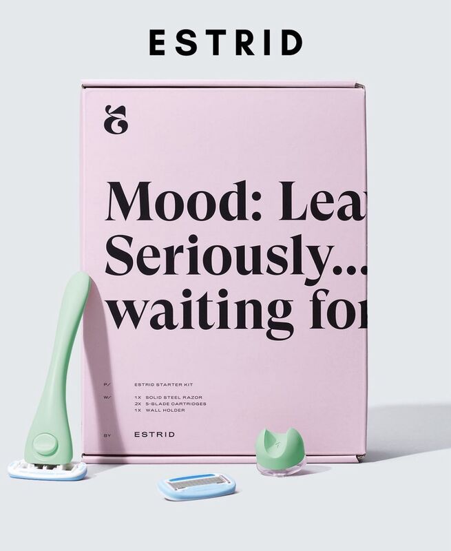
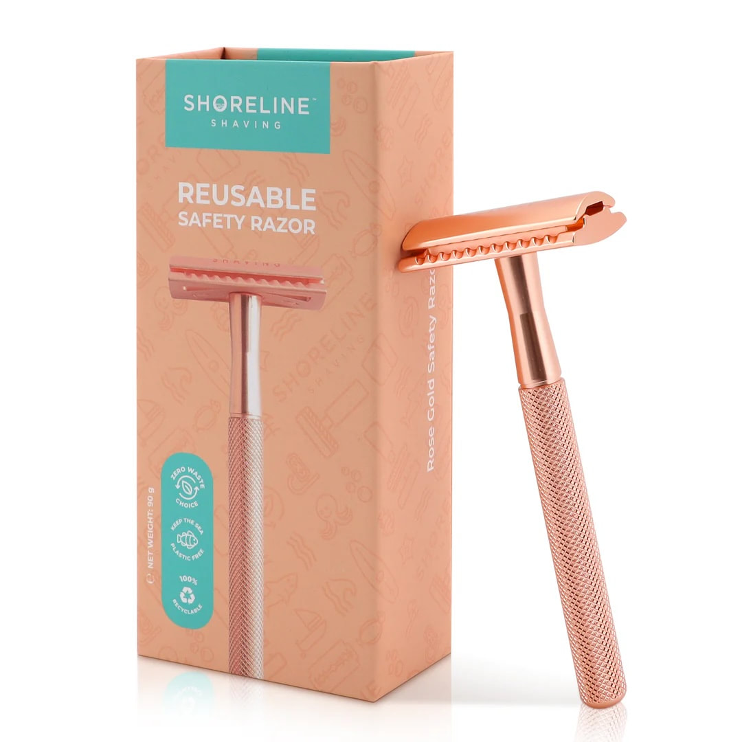
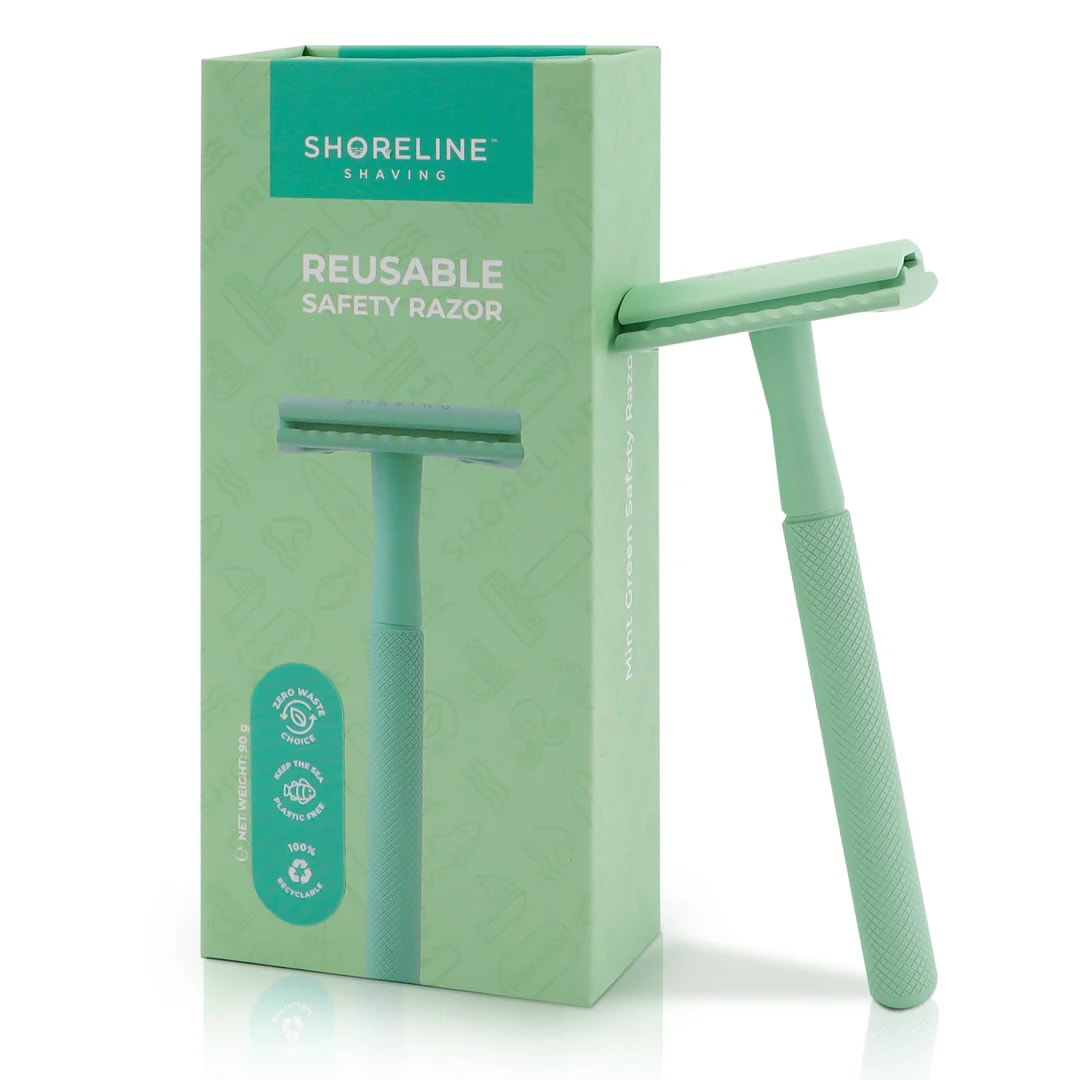
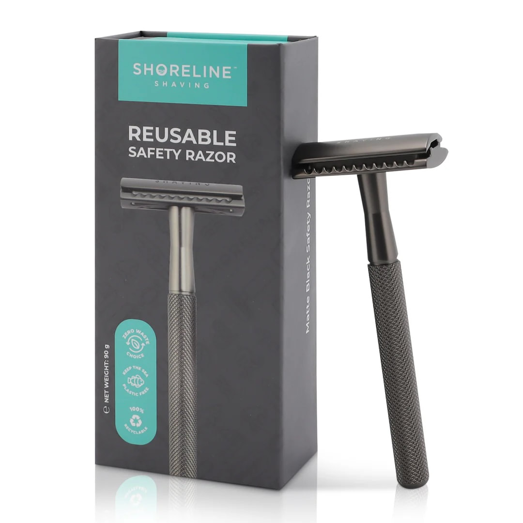
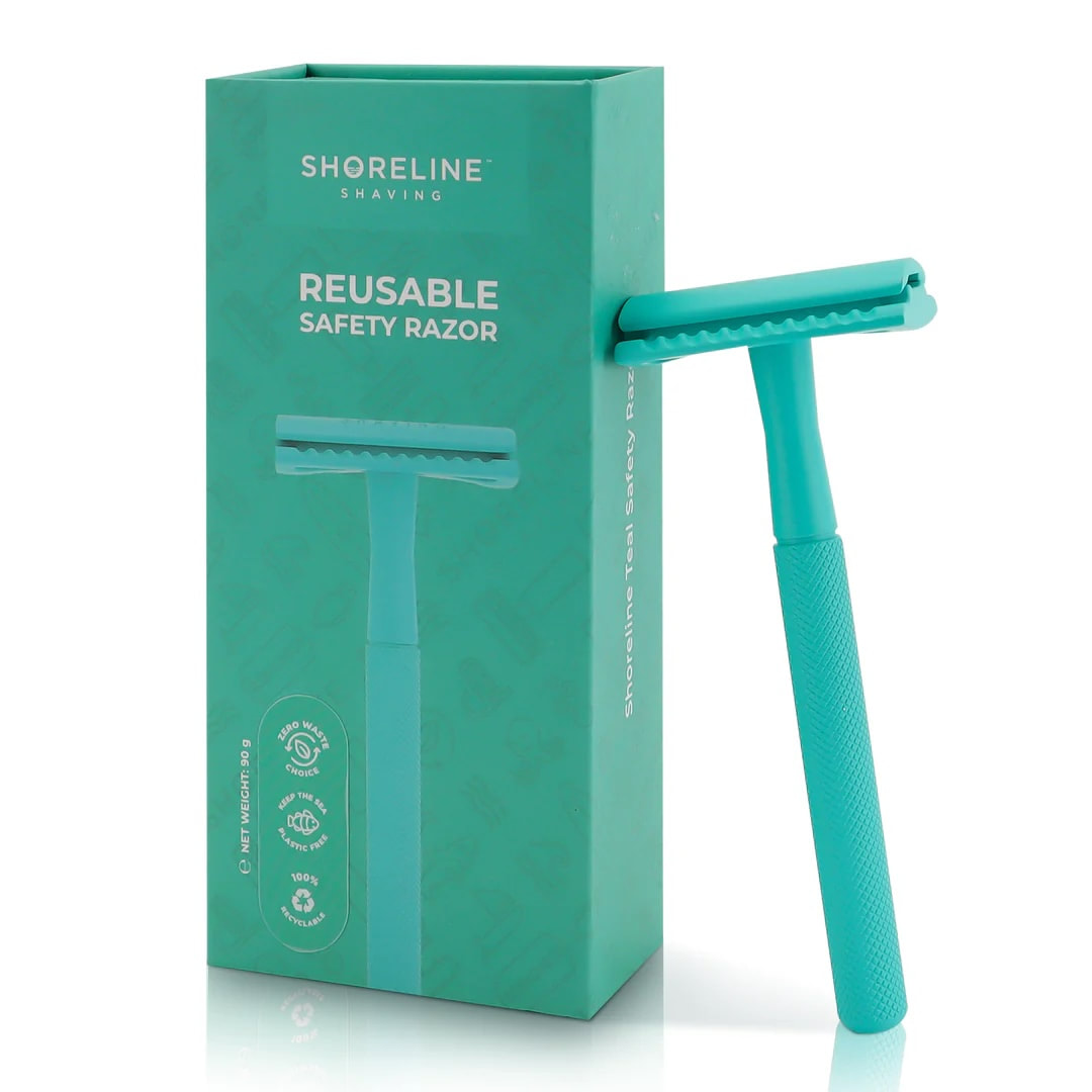
Gender Neutral Packaging
|
|
|
|
Case Study Razors
|
|
Assets

|
|

|

|
|
Remaking of men's

|

|

|

|
Men's Reversed

|

|
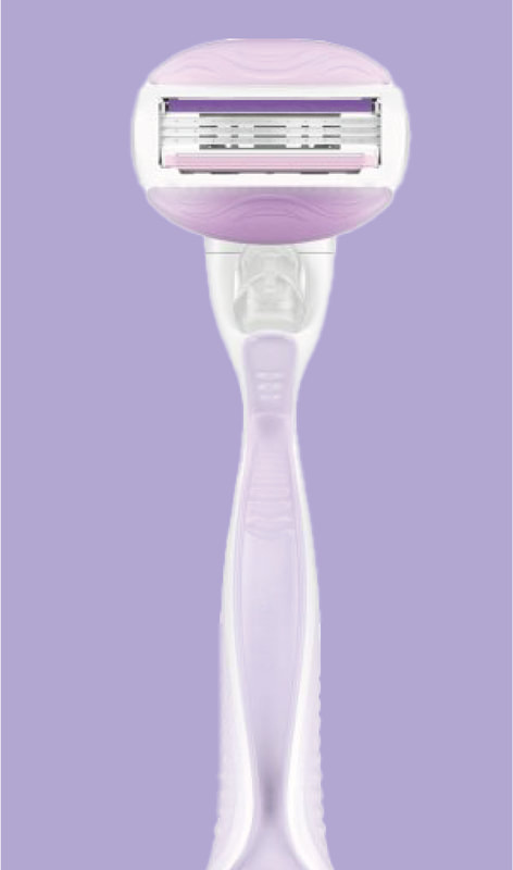
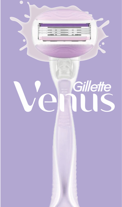
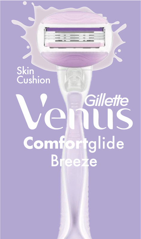
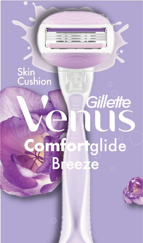
Remaking of women's
|
|
|
|
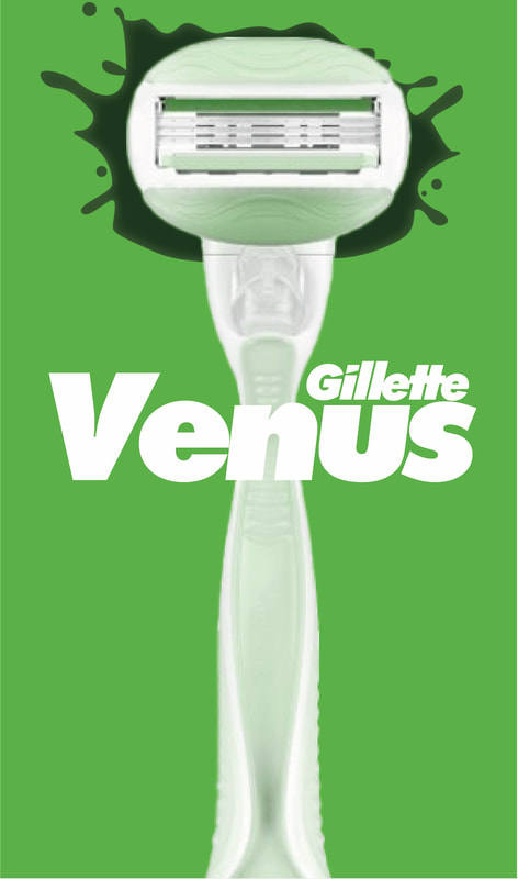
Women's Reversed
|
|
|
|
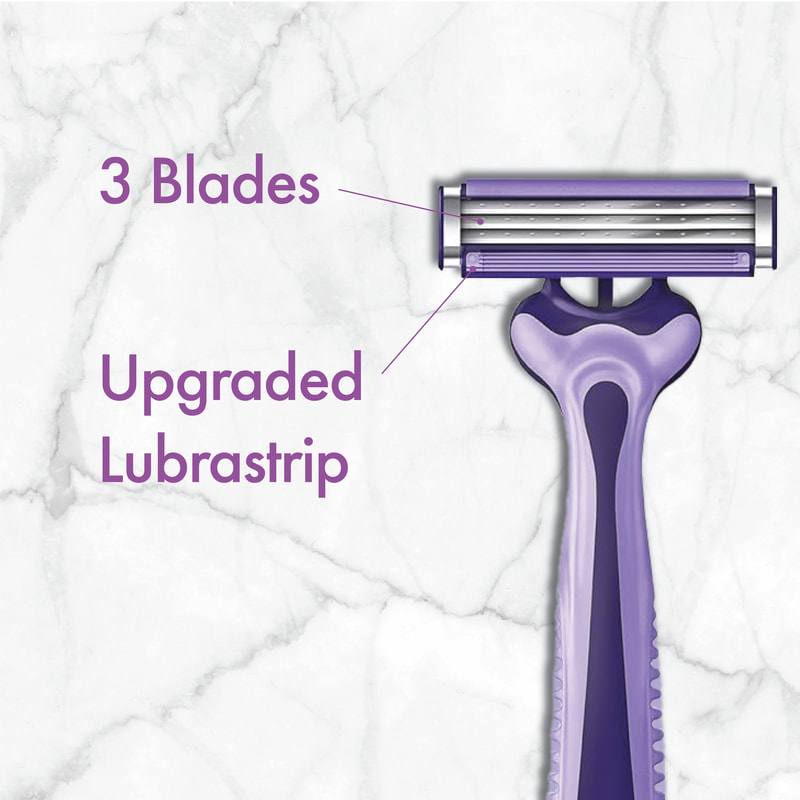
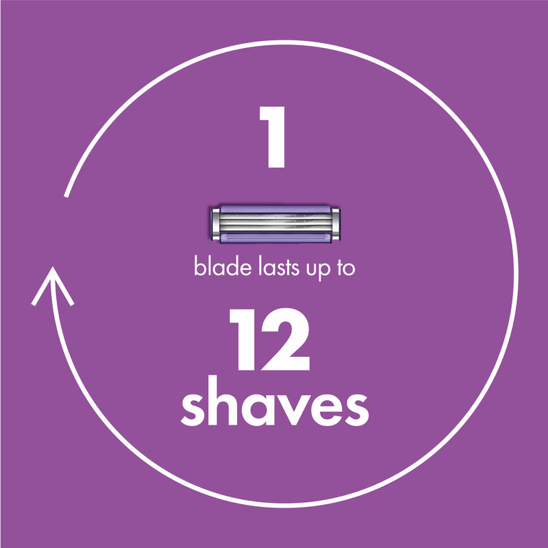
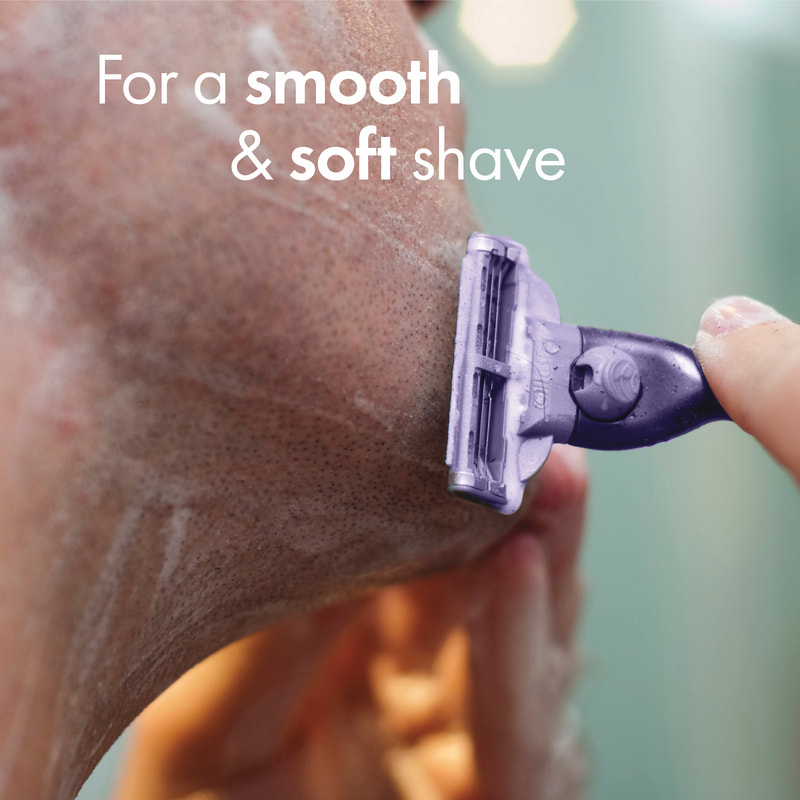
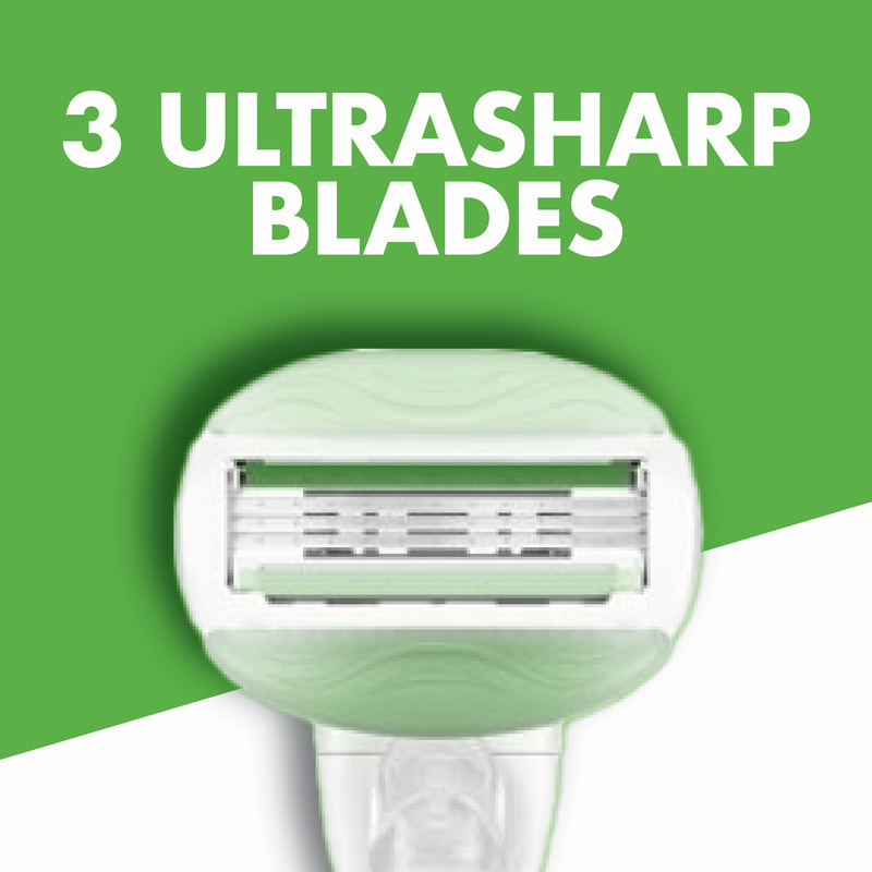
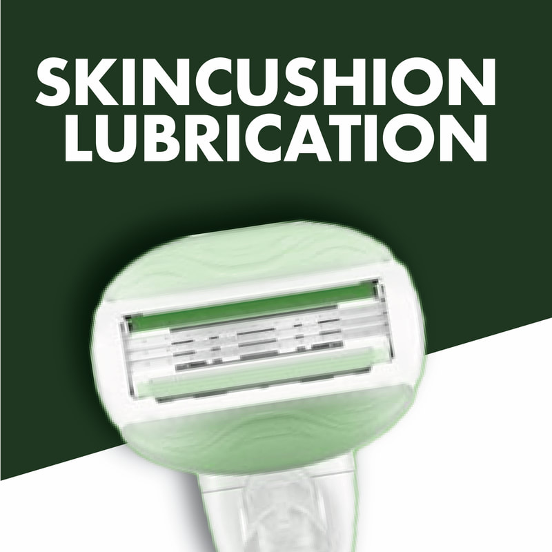
Reverse Ads
|
|
|
|
|
|
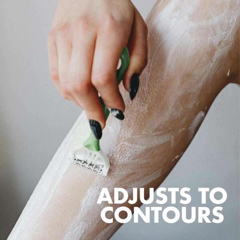
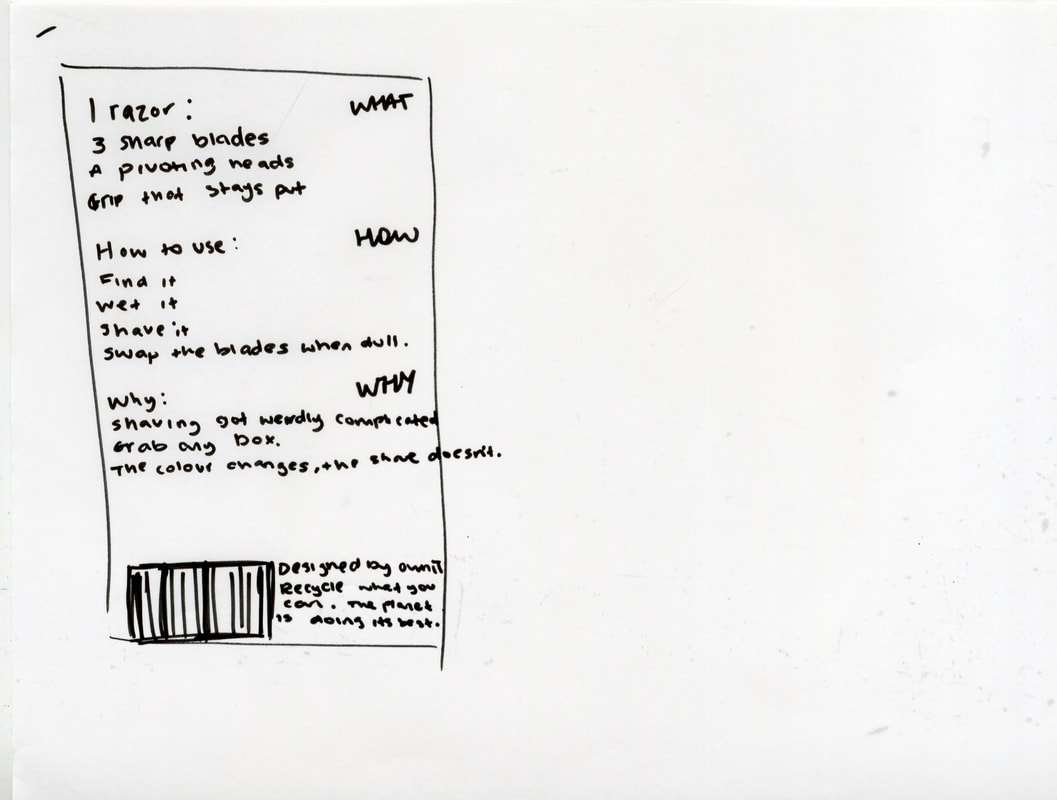
Wasn't as effective as I thought it would be so focusing on the neutral packaging instead.
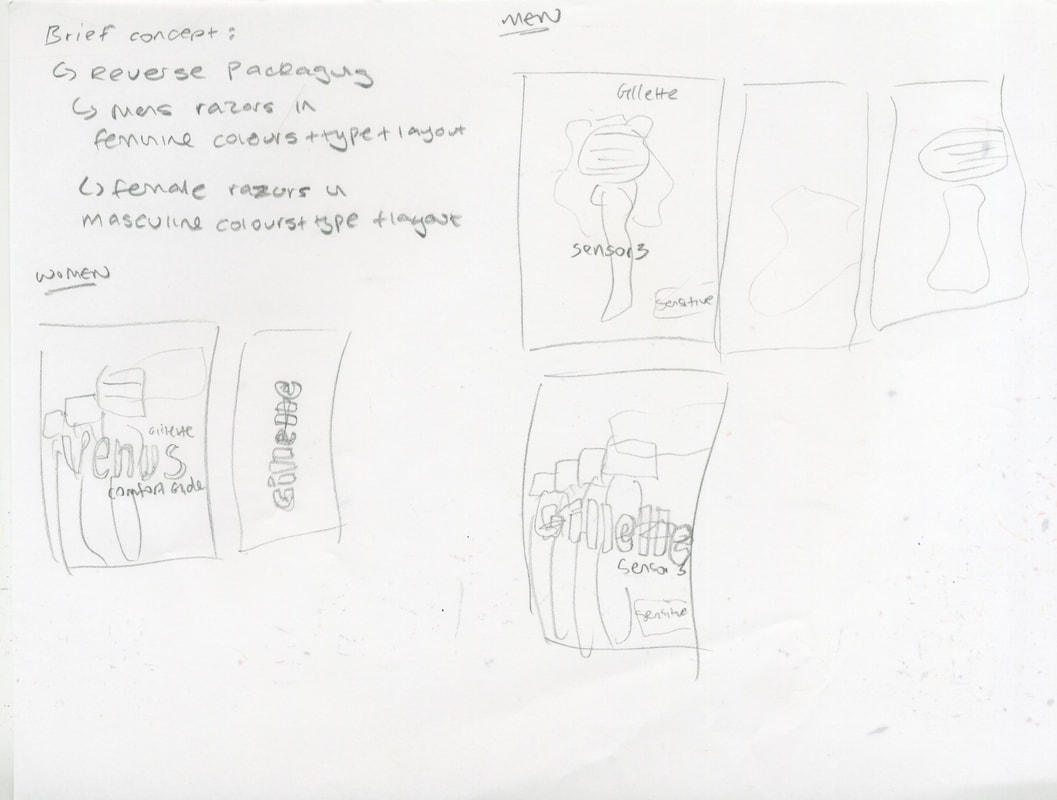
|
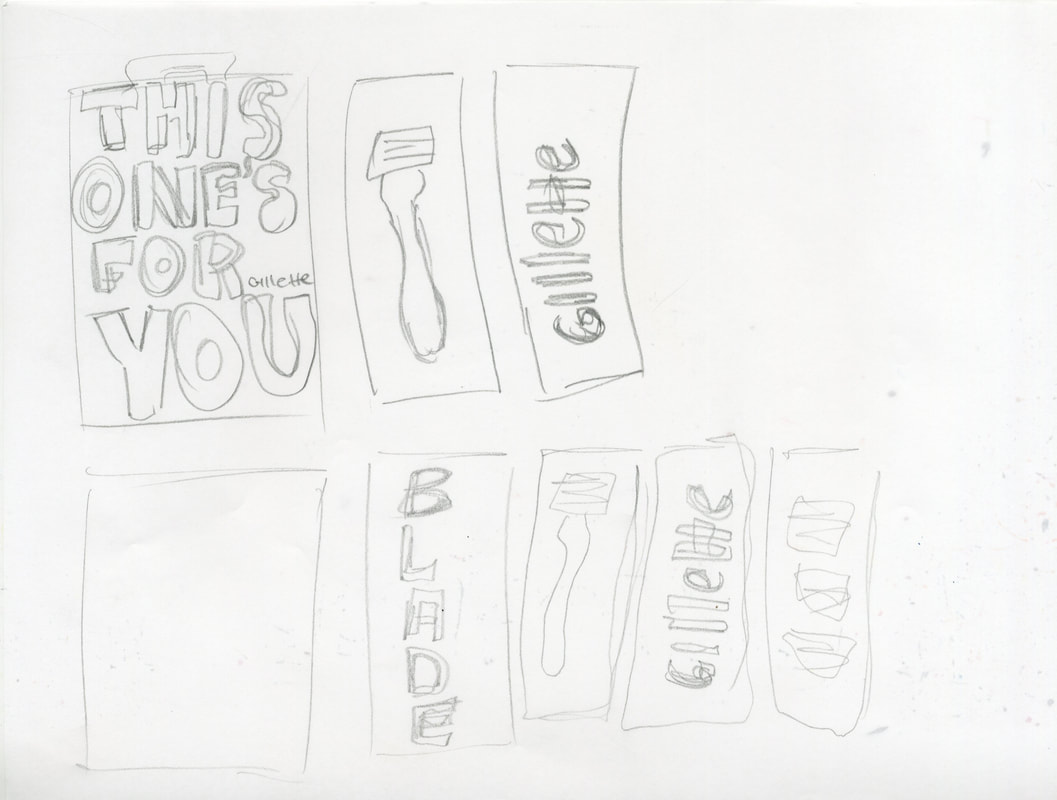
|
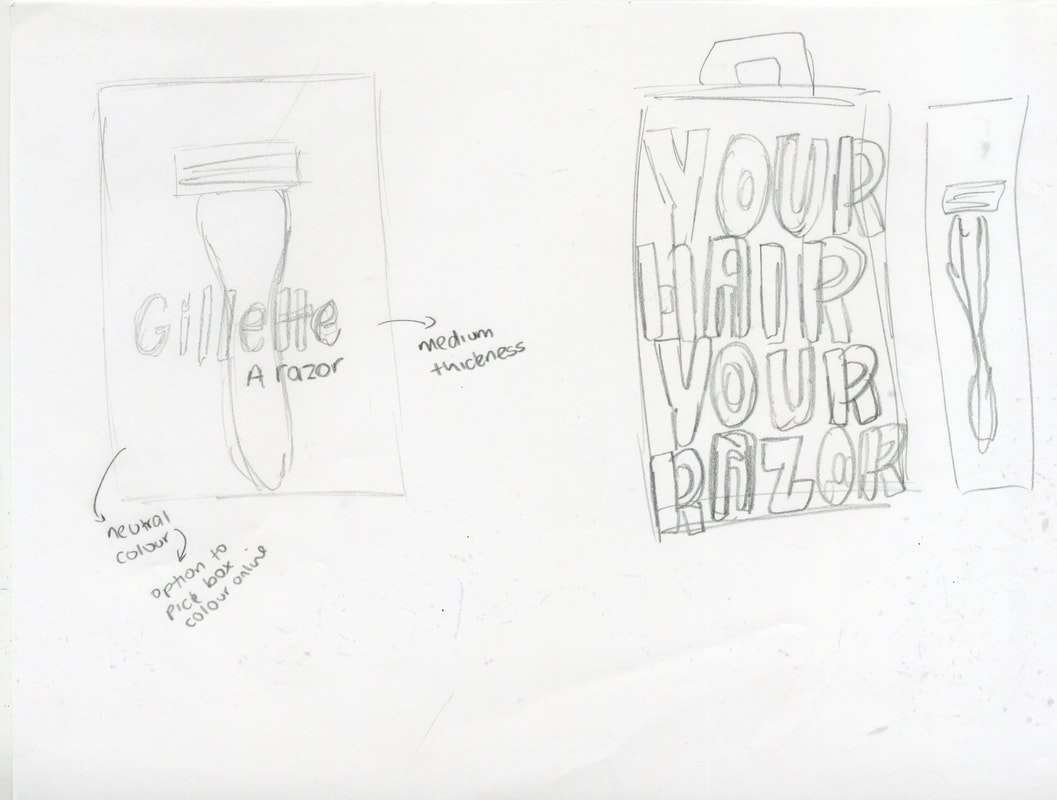
|
|
Development
|
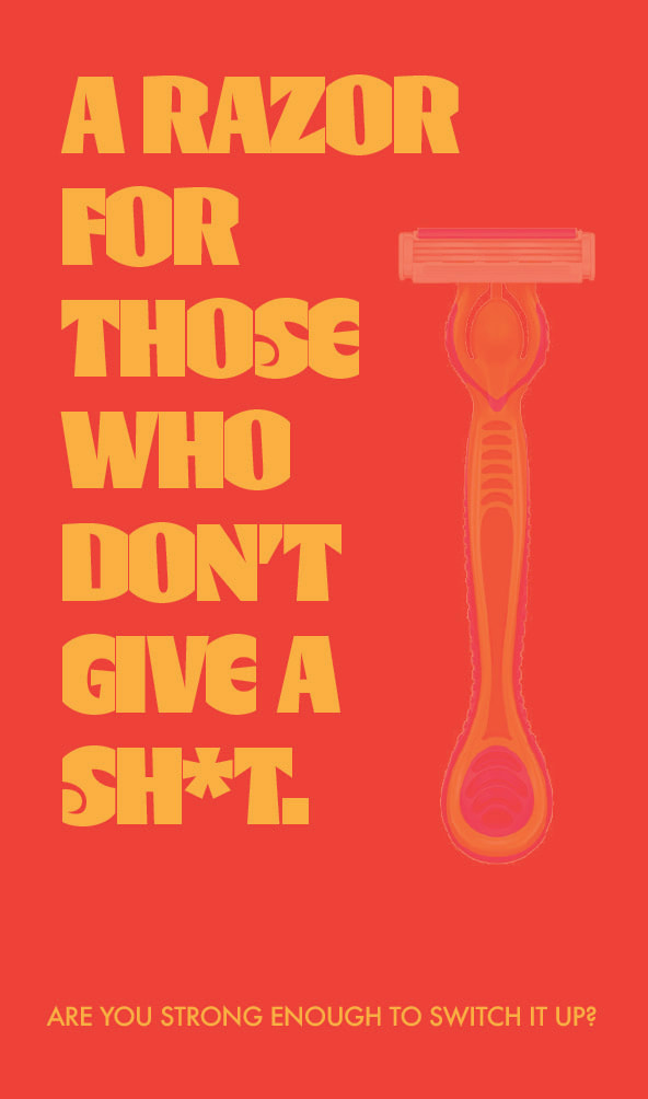
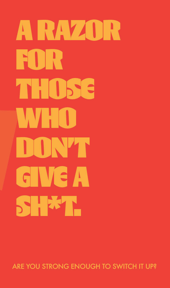
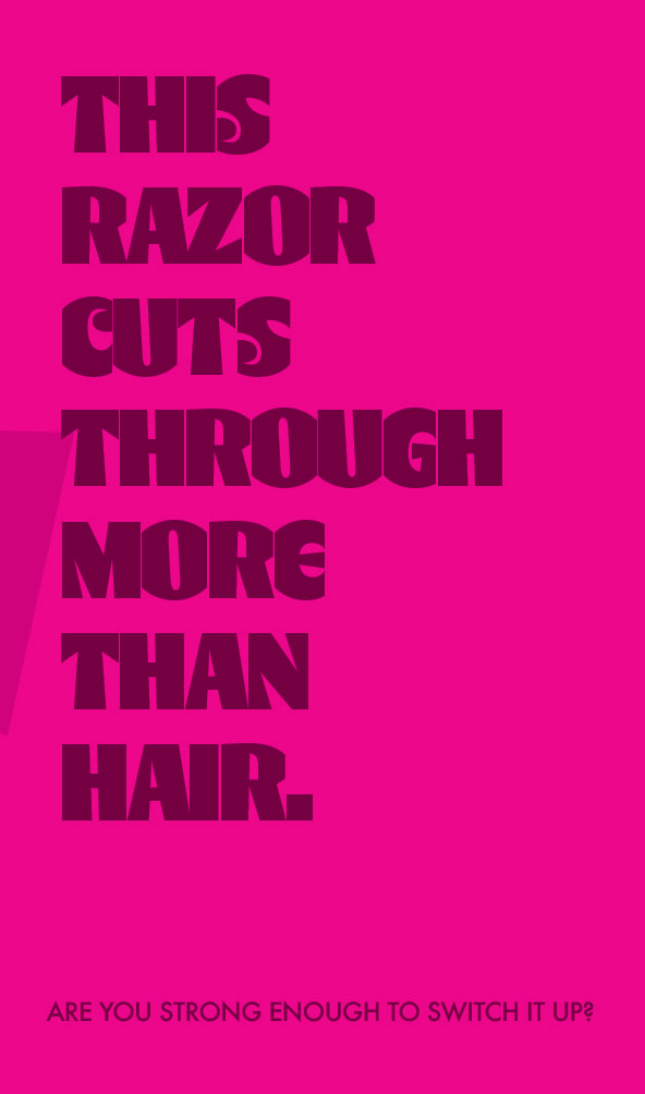
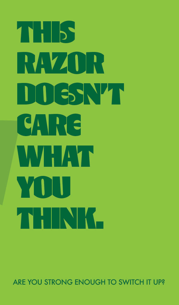
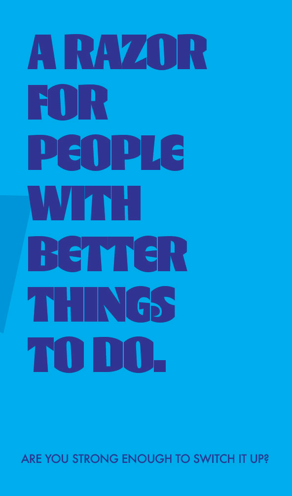
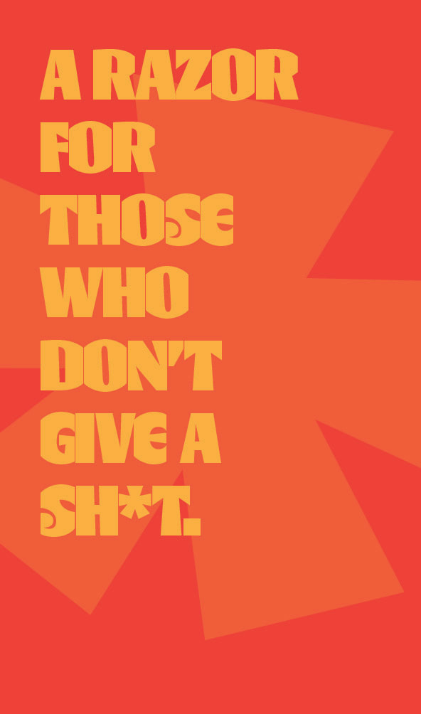
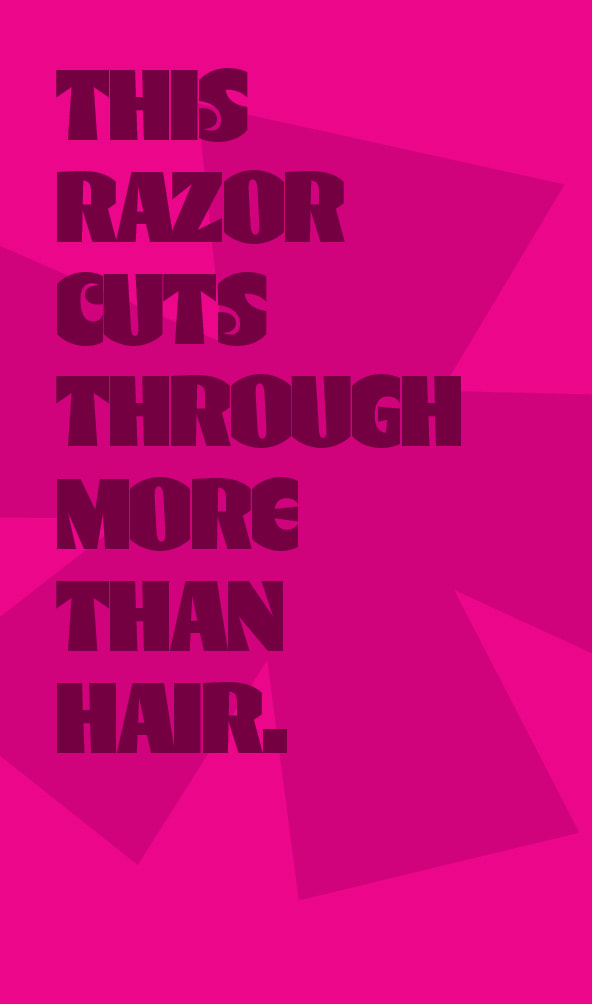
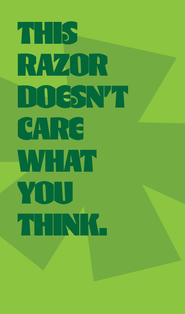
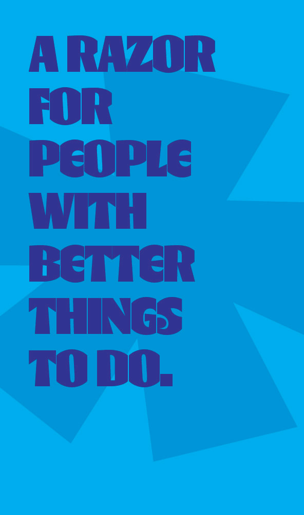
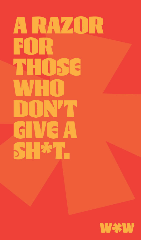
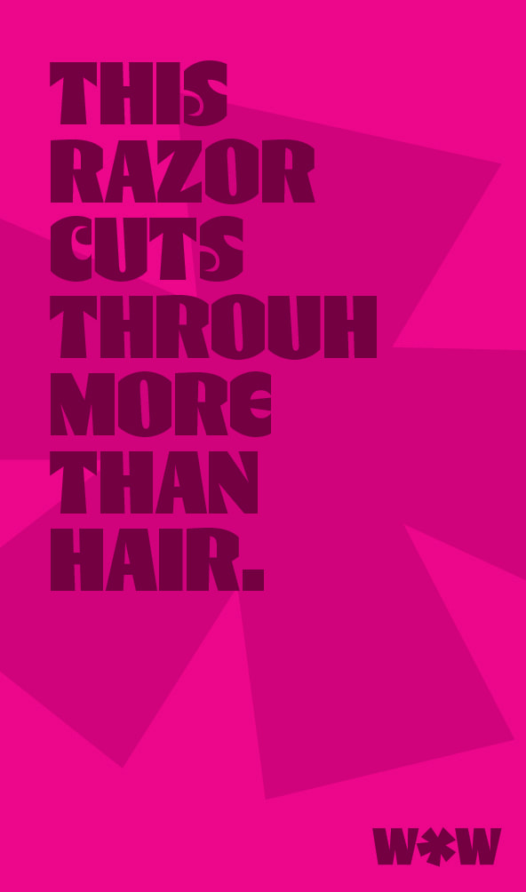
Found this font and immediately liked the way it looked against the punchy lines on the box. Tried too hard to get a razor on the box in the first designs.
|
|
|
|
|
|
|
|
|
|
|
|
|
|
|
|
|
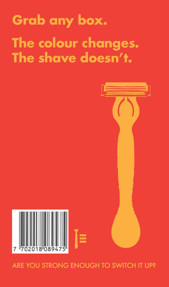
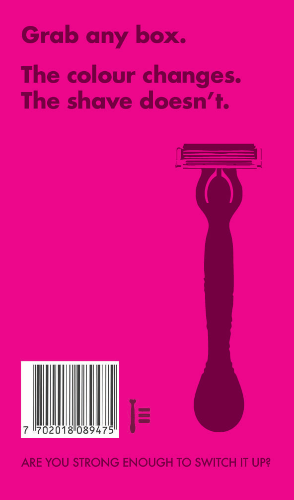
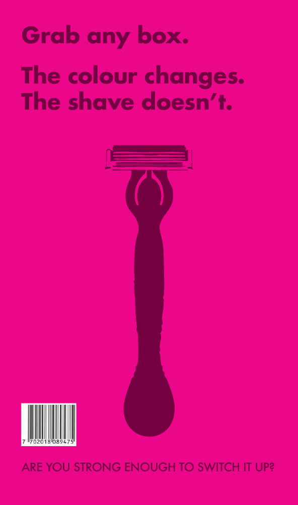
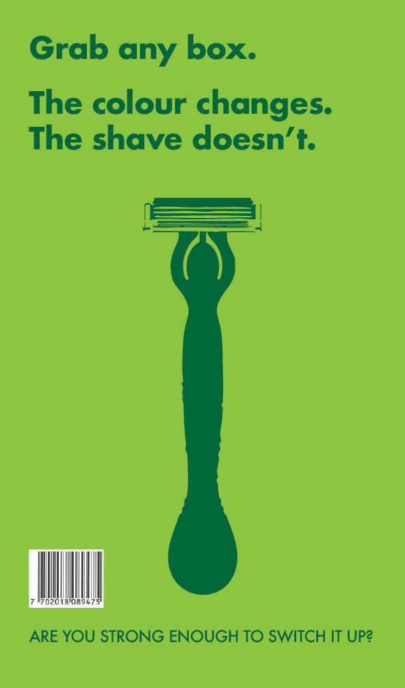
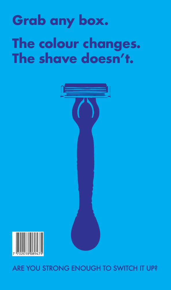
Didn't like the back of the box and lacking brand name.
|
|
|
|
|
|
|
|
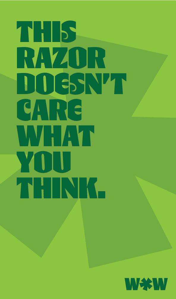
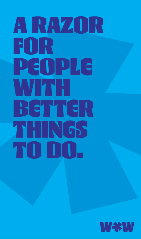
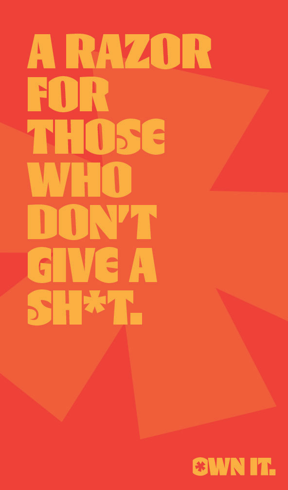
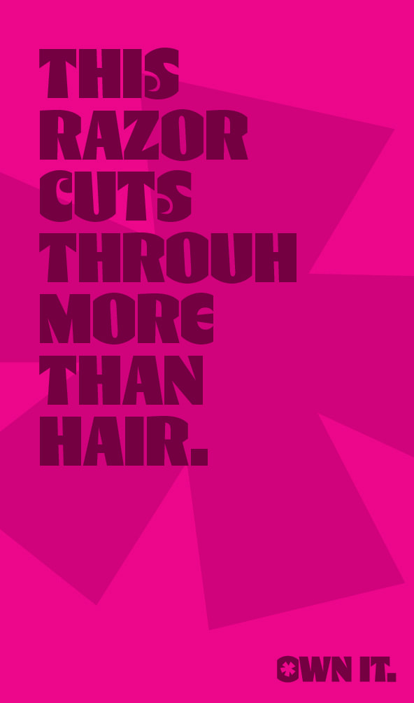
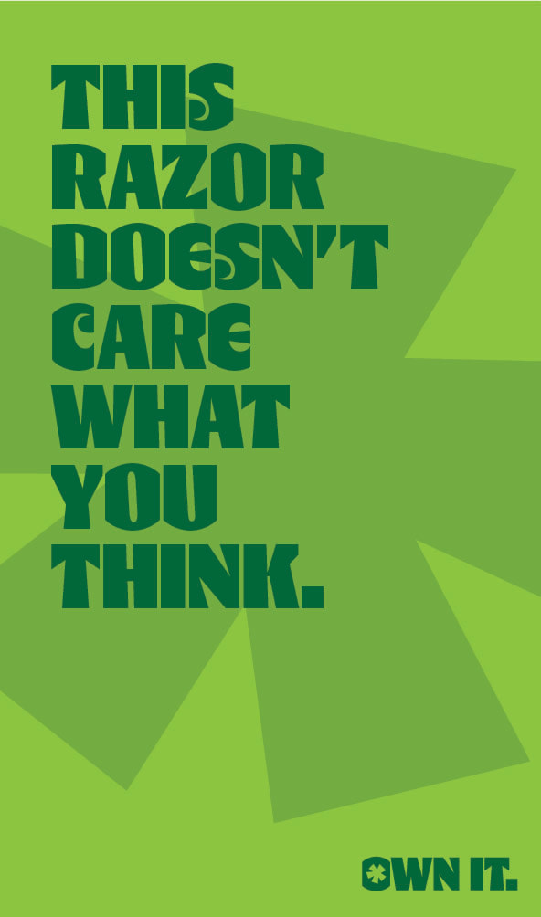
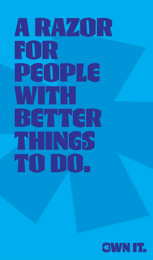
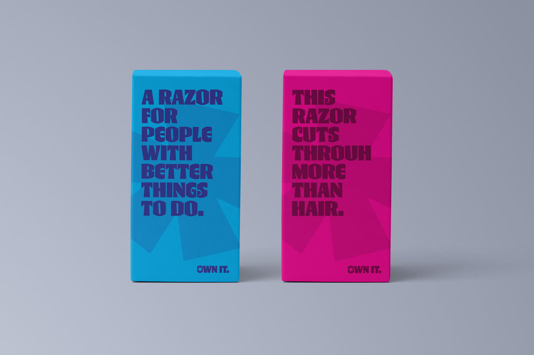
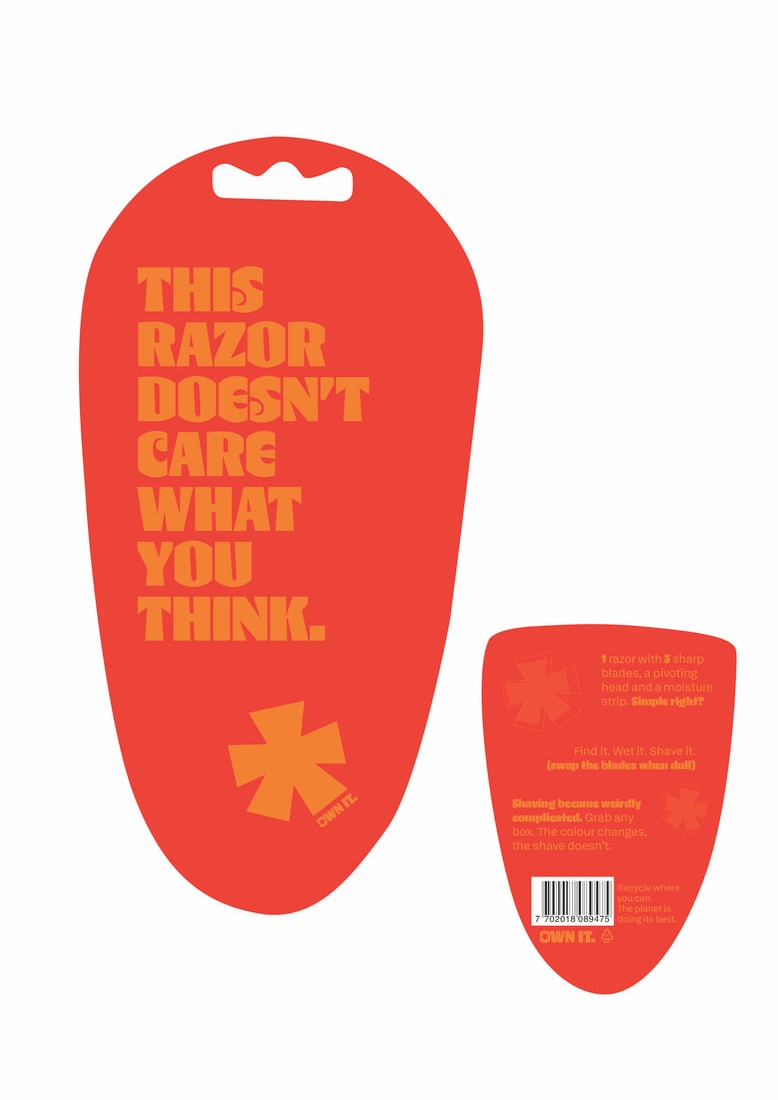
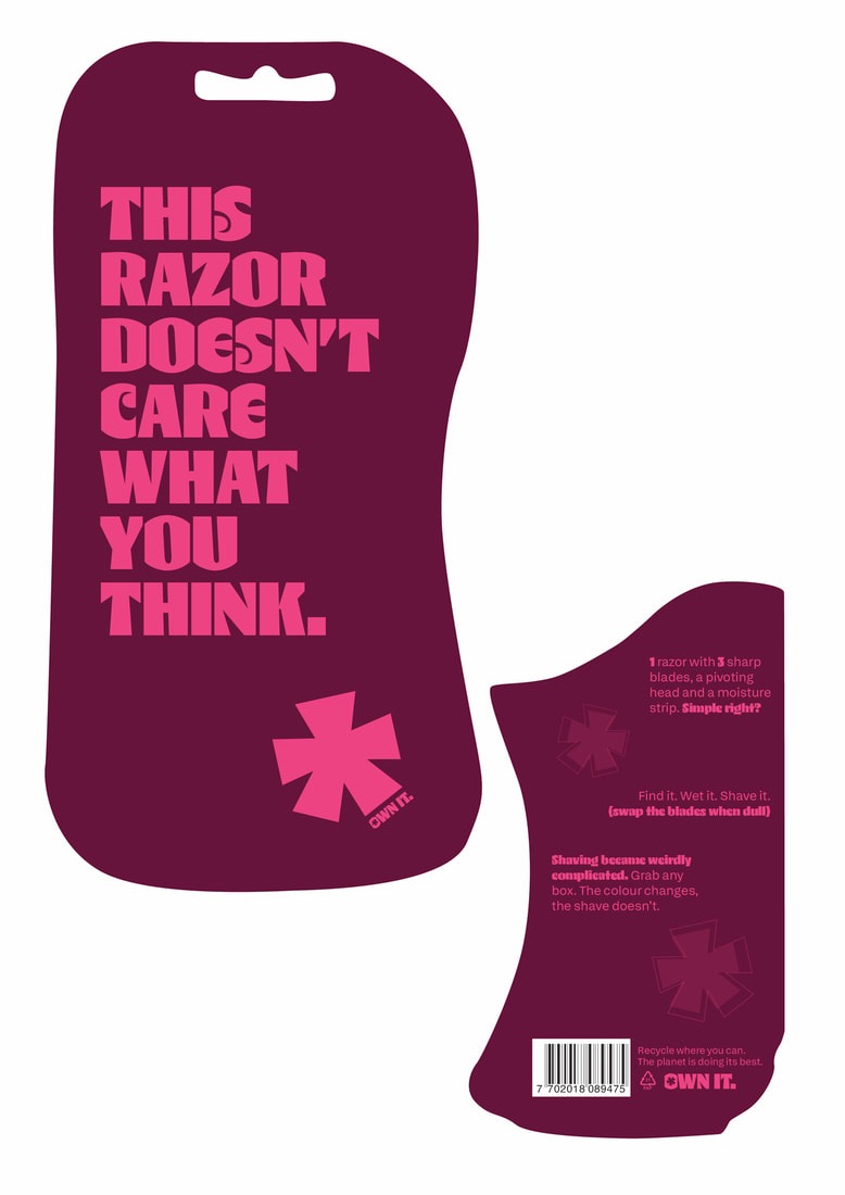
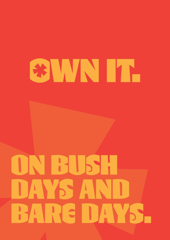
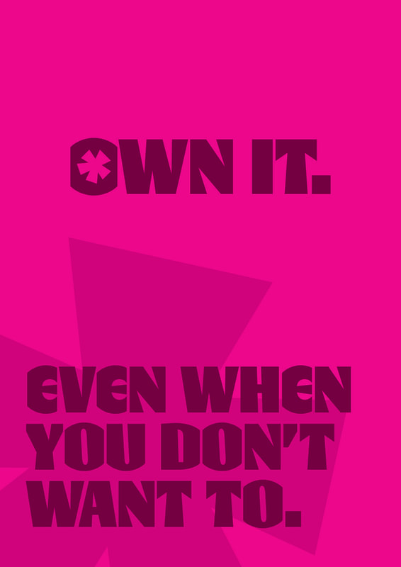
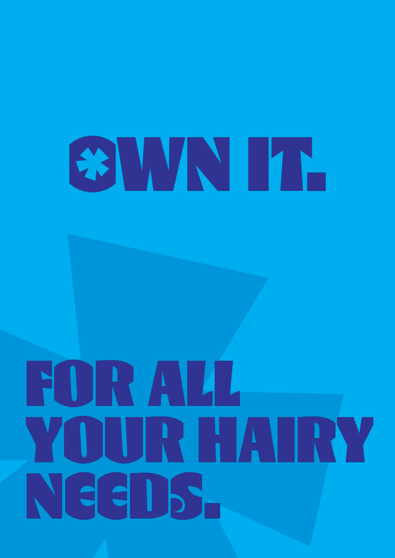
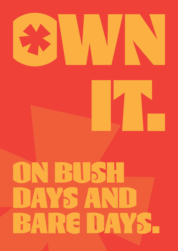
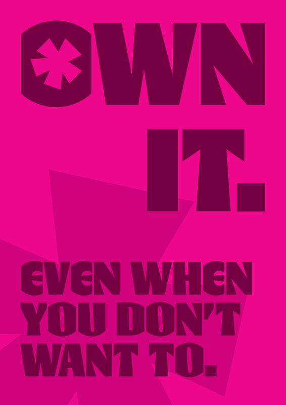
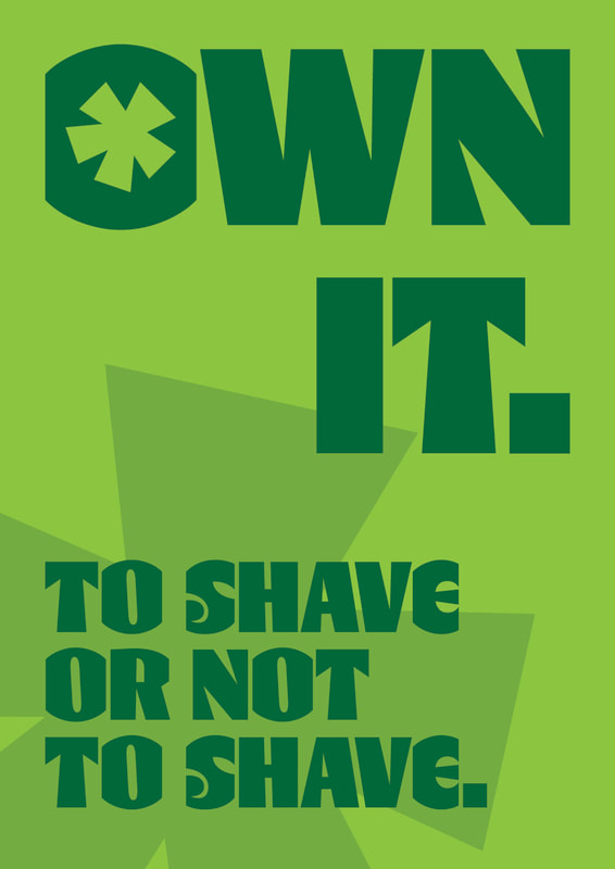
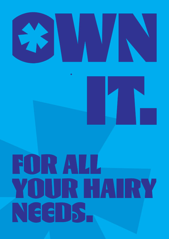
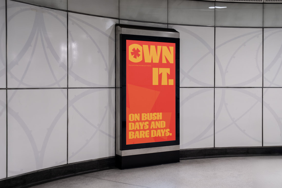
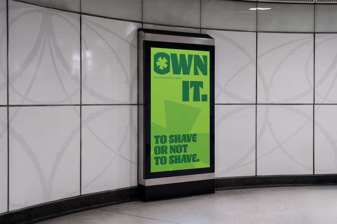
Own it seemed to fit the brand well.
|
|
|
|
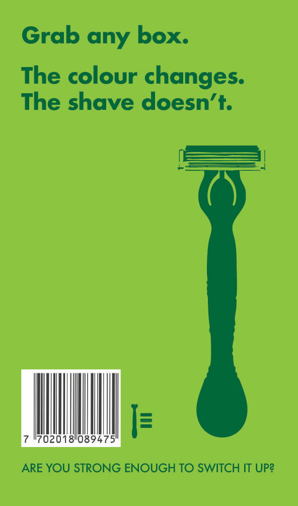
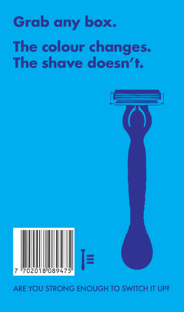
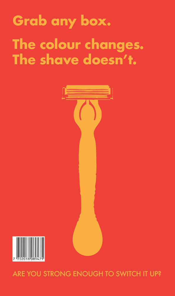
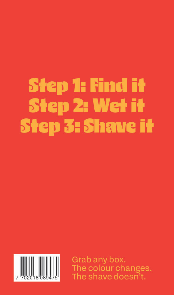
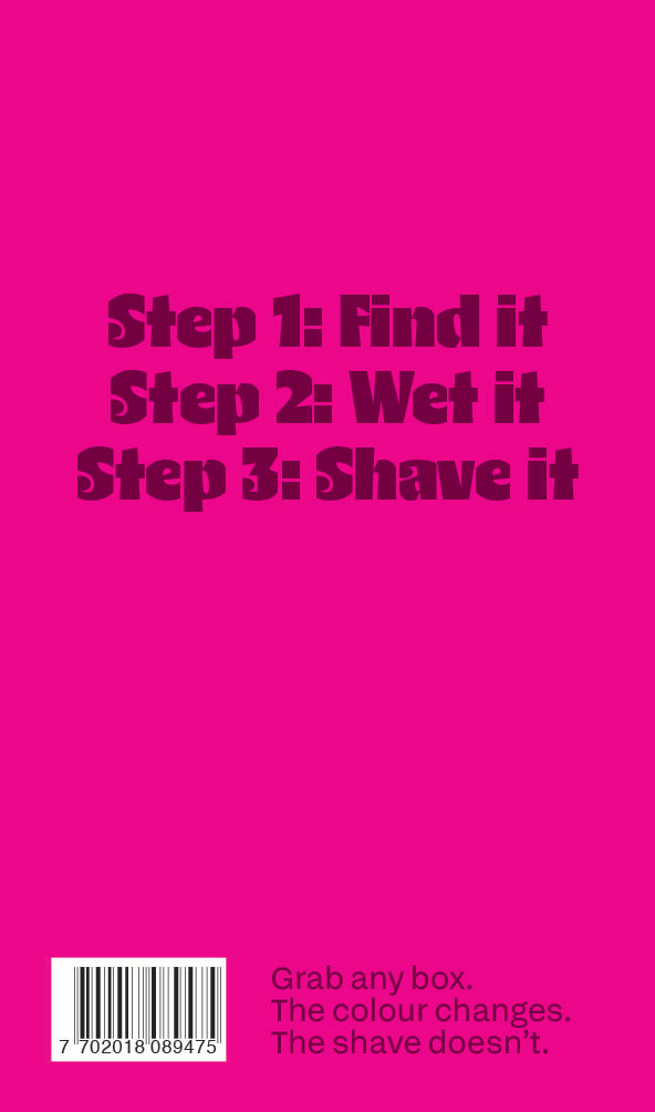
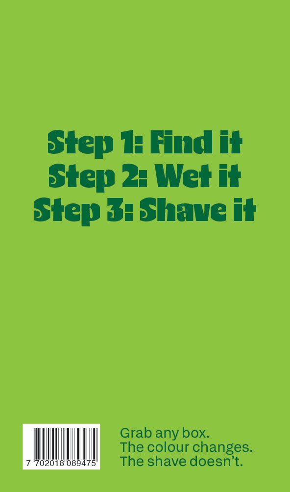
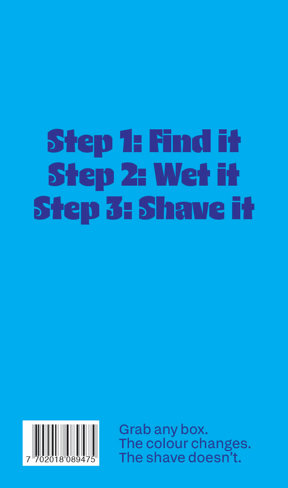
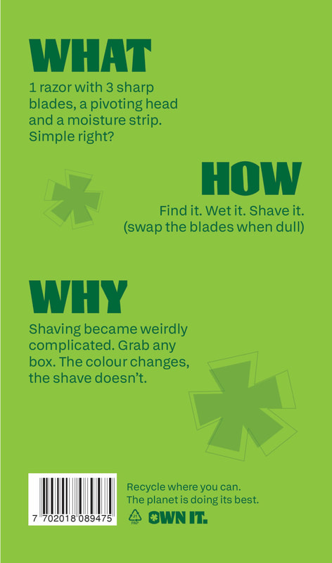
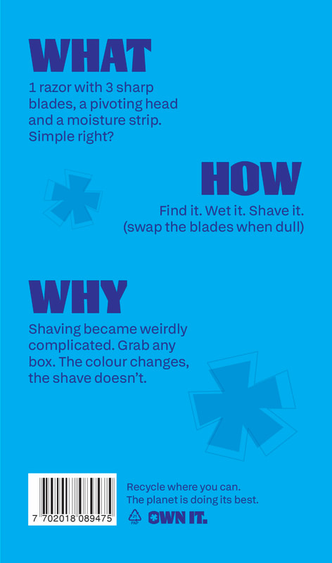
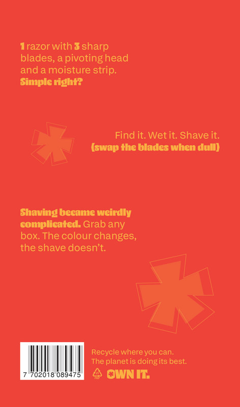
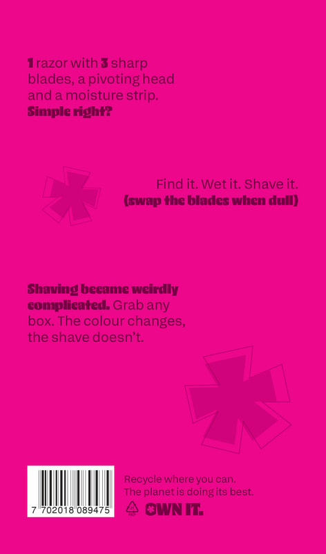
New back design.
|
|
|
|
|
|
|
|
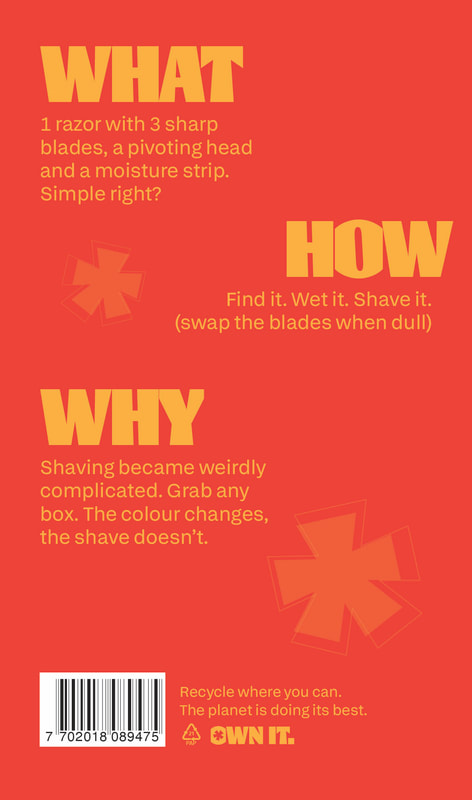
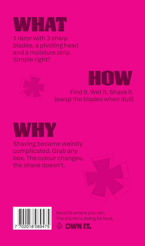
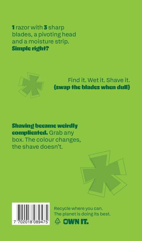
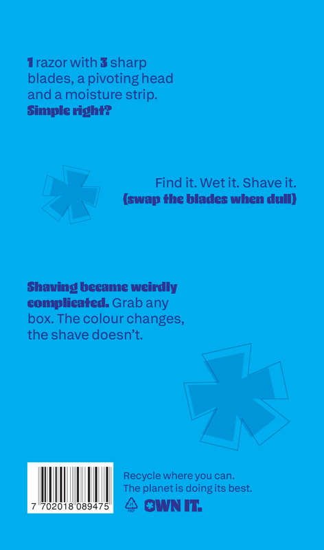
Final back design, needed the information to be more realistic to what you'd find on actual packaging.
|
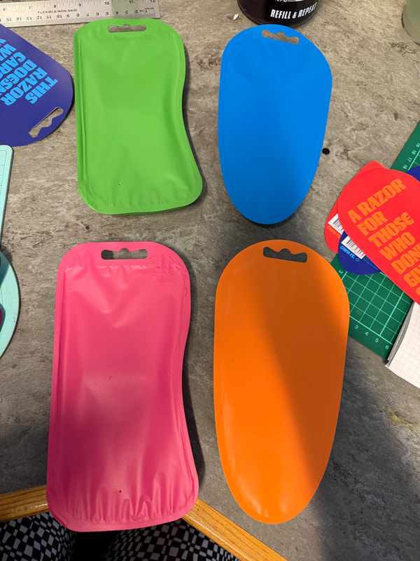
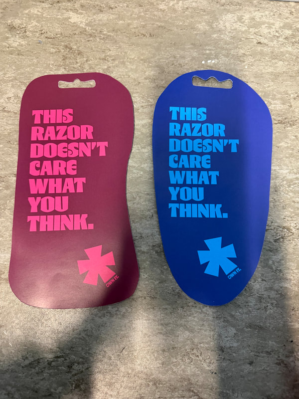
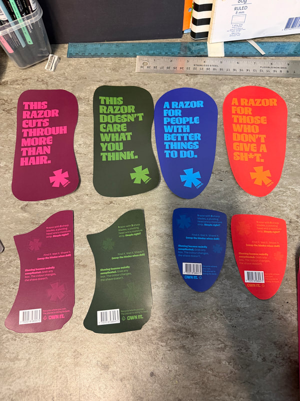
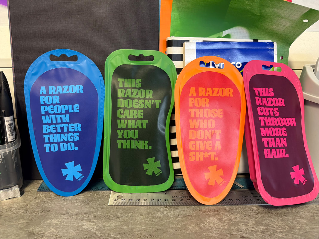
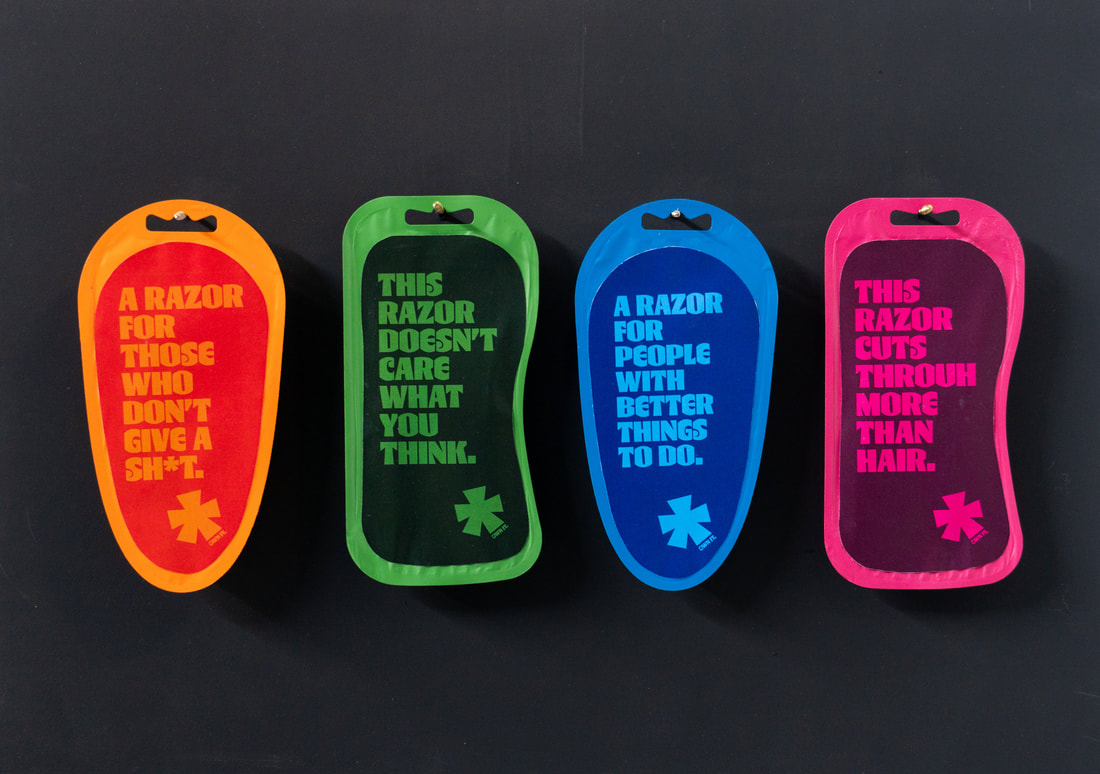
Making them as boxes wasn't selling them to full potential so I purchased razor packaging to spray paint and add my labels onto.
|
|
|

|

|
|
Started off with the front label taking up the whole space of the front but didn't like how it looked so changed the design o be a smaller label that sticks on, similar to the back.
|

|

|

|
|
|
|
Final Four
Promo Posters
|
|

|
|
|
|
|
|
|
|